Blazor Split View
The Blazor Bootstrap Split View component arranges two panes with a draggable divider so users can resize the layout interactively. It supports horizontal and vertical orientations, percentage-based sizing, nested layouts, live resize events, and Bootstrap-aligned divider theming.
Parameters
| Name | Type | Default | Required | Description | Added Version |
|---|---|---|---|---|---|
| Color | SplitViewColor | SplitViewColor.None | Gets or sets the divider color. | 4.0.0 | |
| CustomColor | string? | null | Gets or sets a custom divider color. Accepts any valid CSS color expression, including CSS variables. | 4.0.0 | |
| IsDisabled | bool | false | Gets or sets a value indicating whether user interaction is disabled. | 4.0.0 | |
| MinimumPaneSize | double | 0 | Gets or sets the minimum pane size as a percentage. | 4.0.0 | |
| Orientation | SplitViewOrientation | SplitViewOrientation.Horizontal | Gets or sets the SplitView orientation. | 4.0.0 | |
| Pane1 | RenderFragment | null | ✔️ | Gets or sets the first pane content. | 4.0.0 |
| Pane2 | RenderFragment | null | ✔️ | Gets or sets the second pane content. | 4.0.0 |
| PrimaryPaneSize | double | 50 | Gets or sets the primary pane size as a percentage. | 4.0.0 |
Callback Events
| Event | Description | Added Version |
|---|---|---|
| OnResizeEnded | Fired when resizing ends. | 4.0.0 |
| OnResized | Fired while the divider is being dragged. | 4.0.0 |
| OnResizeStarted | Fired when resizing starts. | 4.0.0 |
| PrimaryPaneSizeChanged | Fired when the primary pane size changes. | 4.0.0 |
Enums
SplitViewColor
| Name | Description |
|---|---|
| None | Uses the shared SplitView CSS variable defaults. |
| Primary | Uses the Bootstrap primary color token. |
| Secondary | Uses the Bootstrap secondary color token. |
| Success | Uses the Bootstrap success color token. |
| Danger | Uses the Bootstrap danger color token. |
| Warning | Uses the Bootstrap warning color token. |
| Info | Uses the Bootstrap info color token. |
| Light | Uses the Bootstrap light color token. |
| Dark | Uses the Bootstrap dark color token. |
| Body | Uses the Bootstrap body background token. |
| BodySecondary | Uses the Bootstrap secondary body background token. |
| BodyTertiary | Uses the Bootstrap tertiary body background token. |
| Black | Uses the Bootstrap black token. |
| White | Uses the Bootstrap white token. |
| Transparent | Uses a transparent divider color. |
SplitViewOrientation
| Name | Description |
|---|---|
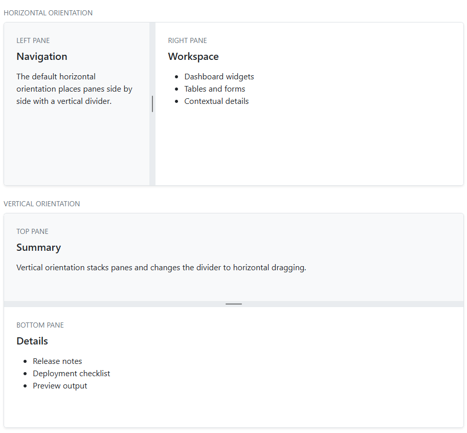
| Horizontal | Arranges panes side by side with a vertical divider. |
| Vertical | Arranges panes top to bottom with a horizontal divider. |
Examples
Pane content
<SplitView Style="height: 360px;">
    <Pane1>
        <div class="p-4">Pane1 content</div>
    </Pane1>
    <Pane2>
        <div class="p-4">Pane2 content</div>
    </Pane2>
</SplitView>
Orientation
<SplitView Orientation="SplitViewOrientation.Vertical"
           MinimumPaneSize="20"
           PrimaryPaneSize="35"
           Style="height: 420px;">
    <Pane1>
        <div class="p-4">Summary</div>
    </Pane1>
    <Pane2>
        <div class="p-4">Details</div>
    </Pane2>
</SplitView>
PrimaryPaneSizeChanged
<SplitView @bind-PrimaryPaneSize="primaryPaneSize"
           Style="height: 380px;">
    <Pane1>
        <div class="p-4">Primary pane</div>
    </Pane1>
    <Pane2>
        <div class="p-4">Secondary pane</div>
    </Pane2>
</SplitView>
@code {
    private double primaryPaneSize = 50;
}
Semantic Color
<SplitView Color="SplitViewColor.Primary"
           Style="height: 320px;">
    <Pane1>
        <div class="p-4">Filters</div>
    </Pane1>
    <Pane2>
        <div class="p-4">Results</div>
    </Pane2>
</SplitView>
Hover and dragging states are derived automatically in shared CSS from the resolved base divider color.
CustomColor
<SplitView CustomColor="rgba(var(--bs-info-rgb), 0.85)"
           Style="height: 320px;">
    <Pane1>
        <div class="p-4">Pane1</div>
    </Pane1>
    <Pane2>
        <div class="p-4">Pane2</div>
    </Pane2>
</SplitView>
Resize events
<SplitView OnResizeStarted="OnResizeStarted"
           OnResized="OnResized"
           OnResizeEnded="OnResizeEnded"
           Style="height: 340px;">
    <Pane1>
        <div class="p-4">Primary pane</div>
    </Pane1>
    <Pane2>
        <div class="p-4">Secondary pane</div>
    </Pane2>
</SplitView>
@code {
    private void OnResizeStarted(SplitViewResizeEventArgs args)
    {
    }

    private void OnResized(SplitViewResizeEventArgs args)
    {
    }

    private void OnResizeEnded(SplitViewResizeEventArgs args)
    {
    }
}
See demo here. See demo here. See demo here.
Nested layouts
SplitView supports nested layouts, which is useful for editors, dashboards, and multi-pane administration tools.
<SplitView PrimaryPaneSize="28" Style="height: 460px;">
    <Pane1>
        <div class="p-4">Explorer</div>
    </Pane1>
    <Pane2>
        <SplitView Orientation="SplitViewOrientation.Vertical"
                   PrimaryPaneSize="62"
                   Style="height: 100%;">
            <Pane1>
                <div class="p-4">Editor</div>
            </Pane1>
            <Pane2>
                <div class="p-4">Preview</div>
            </Pane2>
        </SplitView>
    </Pane2>
</SplitView>