Blazor Accordion
Build vertically collapsing accordions in combination with our Collapse component.
Accordion Parameters
| Name | Type | Default | Required | Description | Added Version |
|---|---|---|---|---|---|
| AlwaysOpen | bool | false | If true, accordion items stay open when another item is opened. | 1.7.0 | |
| ChildContent | RenderFragment | null | ✔️ | Gets or sets the content to be rendered within the component. | 1.7.0 |
| Flush | bool | false | If true, removes borders and rounded corners to render accordions edge-to-edge with their parent container. | 1.7.0 |
Accordion Methods
| Name | Description | Added Version |
|---|---|---|
| HideAccordionItemByIndexAsync(int index) | Hides the AccordionItem by index. | 1.10.5 |
| HideAccordionItemByNameAsync(string accordionItemName) | Hides the AccordionItem by name. | 1.10.5 |
| HideAllAccordionItemsAsync() | Hides all AccordionItem instances. | 1.10.5 |
| HideFirstAccordionItemAsync() | Hides the first AccordionItem. | 1.10.5 |
| HideLastAccordionItemAsync() | Hides the last AccordionItem. | 1.10.5 |
| ShowAccordionItemByIndexAsync(int index) | Shows the AccordionItem by index. | 1.7.0 |
| ShowAccordionItemByNameAsync(string accordionItemName) | Shows the AccordionItem by name. | 1.7.0 |
| ShowAllAccordionItemsAsync() | Shows all AccordionItem instances if AlwaysOpen is true. | 1.10.5 |
| ShowFirstAccordionItemAsync() | Shows the first AccordionItem. | 1.7.0 |
| ShowLastAccordionItemAsync() | Shows the last AccordionItem. | 1.7.0 |
Accordion Events
| Name | Description | Added Version |
|---|---|---|
| OnHidden | This event is fired when a accordion item has been hidden from the user (will wait for CSS transitions to complete). | 1.7.0 |
| OnHiding | This event is fired immediately when the hide method has been called. | 1.7.0 |
| OnShowing | This event fires immediately when the show method is called. | 1.7.0 |
| OnShown | This event is fired when a accordion item has been made visible to the user (will wait for CSS transitions to complete). | 1.7.0 |
AccordionItem Parameters
| Name | Type | Default | Required | Description | Added Version |
|---|---|---|---|---|---|
| Active | bool | false | Gets or sets the active state. | 1.7.0 | |
| Content | RenderFragment | null | ✔️ | Gets or sets the content to be rendered within the component. | 1.7.0 |
| Name | string | null | Gets or sets the name. | 1.7.0 | |
| Title | string | null | Gets or sets the title. | 1.7.0 | |
| TitleTemplate | RenderFragment | null | Gets or sets the title template. | 1.7.0 |
Examples
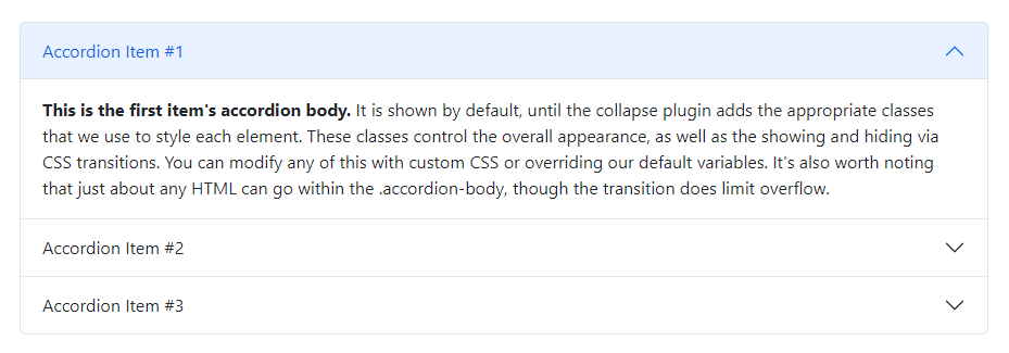
Accordion
Click the accordions below to expand/collapse the accordion content.

<Accordion>
    <AccordionItem Title="Accordion Item #1">
        <Content>
            <b>This is the first item's accordion body.</b> It is shown by default, until the collapse plugin adds the appropriate classes that we use to style each element. These classes control the overall appearance, as well as the showing and hiding via CSS transitions. You can modify any of this with custom CSS or overriding our default variables. It's also worth noting that just about any HTML can go within the .accordion-body, though the transition does limit overflow.
        </Content>
    </AccordionItem>
    <AccordionItem Title="Accordion Item #2">
        <Content>
            <b>This is the second item's accordion body.</b> It is hidden by default, until the collapse plugin adds the appropriate classes that we use to style each element. These classes control the overall appearance, as well as the showing and hiding via CSS transitions. You can modify any of this with custom CSS or overriding our default variables. It's also worth noting that just about any HTML can go within the .accordion-body, though the transition does limit overflow.
        </Content>
    </AccordionItem>
    <AccordionItem Title="Accordion Item #3">
        <Content>
            <b>This is the third item's accordion body.</b> It is hidden by default, until the collapse plugin adds the appropriate classes that we use to style each element. These classes control the overall appearance, as well as the showing and hiding via CSS transitions. You can modify any of this with custom CSS or overriding our default variables. It's also worth noting that just about any HTML can go within the .accordion-body, though the transition does limit overflow.
        </Content>
    </AccordionItem>
</Accordion>
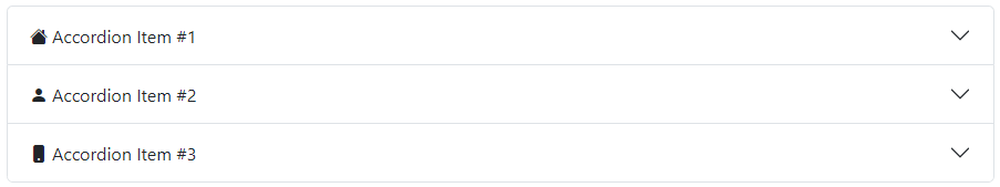
Title with Icon
To customize the accordion title, use TitleTemplate, as shown in the below example.
<Accordion>
    <AccordionItem>
        <TitleTemplate>
            <Icon Name="IconName.HouseFill" Class="me-1" /> Accordion Item #1
        </TitleTemplate>
        <Content>
            <b>This is the first item's accordion body.</b> It is shown by default, until the collapse plugin adds the appropriate classes that we use to style each element. These classes control the overall appearance, as well as the showing and hiding via CSS transitions. You can modify any of this with custom CSS or overriding our default variables. It's also worth noting that just about any HTML can go within the .accordion-body, though the transition does limit overflow.
        </Content>
    </AccordionItem>
    <AccordionItem>
        <TitleTemplate>
            <Icon Name="IconName.PersonFill" Class="me-1" /> Accordion Item #2
        </TitleTemplate>
        <Content>
            <b>This is the second item's accordion body.</b> It is hidden by default, until the collapse plugin adds the appropriate classes that we use to style each element. These classes control the overall appearance, as well as the showing and hiding via CSS transitions. You can modify any of this with custom CSS or overriding our default variables. It's also worth noting that just about any HTML can go within the .accordion-body, though the transition does limit overflow.
        </Content>
    </AccordionItem>
    <AccordionItem>
        <TitleTemplate>
            <Icon Name="IconName.PhoneFill" Class="me-1" /> Accordion Item #3
        </TitleTemplate>
        <Content>
            <b>This is the third item's accordion body.</b> It is hidden by default, until the collapse plugin adds the appropriate classes that we use to style each element. These classes control the overall appearance, as well as the showing and hiding via CSS transitions. You can modify any of this with custom CSS or overriding our default variables. It's also worth noting that just about any HTML can go within the .accordion-body, though the transition does limit overflow.
        </Content>
    </AccordionItem>
</Accordion>
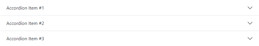
Flush
Set the Flush parameter to true to remove borders and rounded corners to render accordions edge-to-edge with their parent container.
<Accordion Flush="true">
    <AccordionItem Title="Accordion Item #1">
        <Content>
            <b>This is the first item's accordion body.</b> It is shown by default, until the collapse plugin adds the appropriate classes that we use to style each element. These classes control the overall appearance, as well as the showing and hiding via CSS transitions. You can modify any of this with custom CSS or overriding our default variables. It's also worth noting that just about any HTML can go within the .accordion-body, though the transition does limit overflow.
        </Content>
    </AccordionItem>
    <AccordionItem Title="Accordion Item #2">
        <Content>
            <b>This is the second item's accordion body.</b> It is hidden by default, until the collapse plugin adds the appropriate classes that we use to style each element. These classes control the overall appearance, as well as the showing and hiding via CSS transitions. You can modify any of this with custom CSS or overriding our default variables. It's also worth noting that just about any HTML can go within the .accordion-body, though the transition does limit overflow.
        </Content>
    </AccordionItem>
    <AccordionItem Title="Accordion Item #3">
        <Content>
            <b>This is the third item's accordion body.</b> It is hidden by default, until the collapse plugin adds the appropriate classes that we use to style each element. These classes control the overall appearance, as well as the showing and hiding via CSS transitions. You can modify any of this with custom CSS or overriding our default variables. It's also worth noting that just about any HTML can go within the .accordion-body, though the transition does limit overflow.
        </Content>
    </AccordionItem>
</Accordion>
Set default active accordion item
Set the Active parameter to true to keep the accordion item open by default.

<Accordion>
    <AccordionItem Title="Accordion Item #1">
        <Content>
            <b>This is the first item's accordion body.</b> It is shown by default, until the collapse plugin adds the appropriate classes that we use to style each element. These classes control the overall appearance, as well as the showing and hiding via CSS transitions. You can modify any of this with custom CSS or overriding our default variables. It's also worth noting that just about any HTML can go within the .accordion-body, though the transition does limit overflow.
        </Content>
    </AccordionItem>
    <AccordionItem Title="Accordion Item #2" Active="true">
        <Content>
            <b>This is the second item's accordion body.</b> It is hidden by default, until the collapse plugin adds the appropriate classes that we use to style each element. These classes control the overall appearance, as well as the showing and hiding via CSS transitions. You can modify any of this with custom CSS or overriding our default variables. It's also worth noting that just about any HTML can go within the .accordion-body, though the transition does limit overflow.
        </Content>
    </AccordionItem>
    <AccordionItem Title="Accordion Item #3">
        <Content>
            <b>This is the third item's accordion body.</b> It is hidden by default, until the collapse plugin adds the appropriate classes that we use to style each element. These classes control the overall appearance, as well as the showing and hiding via CSS transitions. You can modify any of this with custom CSS or overriding our default variables. It's also worth noting that just about any HTML can go within the .accordion-body, though the transition does limit overflow.
        </Content>
    </AccordionItem>
</Accordion>
Always open
Set the AlwaysOpen parameter to true to keep accordion items open when another item is opened.

<Accordion AlwaysOpen="true">
    <AccordionItem Title="Accordion Item #1">
        <Content>
            <b>This is the first item's accordion body.</b> It is shown by default, until the collapse plugin adds the appropriate classes that we use to style each element. These classes control the overall appearance, as well as the showing and hiding via CSS transitions. You can modify any of this with custom CSS or overriding our default variables. It's also worth noting that just about any HTML can go within the .accordion-body, though the transition does limit overflow.
        </Content>
    </AccordionItem>
    <AccordionItem Title="Accordion Item #2">
        <Content>
            <b>This is the second item's accordion body.</b> It is hidden by default, until the collapse plugin adds the appropriate classes that we use to style each element. These classes control the overall appearance, as well as the showing and hiding via CSS transitions. You can modify any of this with custom CSS or overriding our default variables. It's also worth noting that just about any HTML can go within the .accordion-body, though the transition does limit overflow.
        </Content>
    </AccordionItem>
    <AccordionItem Title="Accordion Item #3">
        <Content>
            <b>This is the third item's accordion body.</b> It is hidden by default, until the collapse plugin adds the appropriate classes that we use to style each element. These classes control the overall appearance, as well as the showing and hiding via CSS transitions. You can modify any of this with custom CSS or overriding our default variables. It's also worth noting that just about any HTML can go within the .accordion-body, though the transition does limit overflow.
        </Content>
    </AccordionItem>
</Accordion>
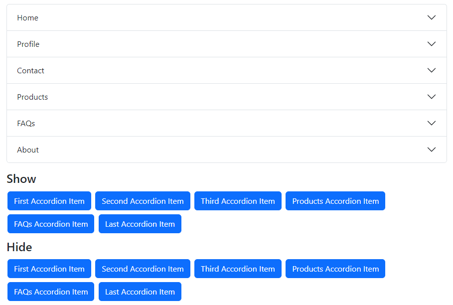
Show / hide individual accordion items
You can show and hide individual accordion items in several ways.
- To show an accordion item, use predefined methods
ShowFirstAccordionItemAsync,ShowLastAccordionItemAsync,ShowAccordionItemByNameAsync, andShowAccordionItemByIndexAsync. - To hide an accordion item, use predefined methods
HideFirstAccordionItemAsync,HideLastAccordionItemAsync,HideAccordionItemByNameAsync, andHideAccordionItemByIndexAsync.
<Accordion @ref="accordion1" Class="mb-3">
    <AccordionItem Title="Home" Name="AccordionItem1">
        <Content>
            <b>This is the first item's accordion body.</b> It is shown by default, until the collapse plugin adds the appropriate classes that we use to style each element. These classes control the overall appearance, as well as the showing and hiding via CSS transitions. You can modify any of this with custom CSS or overriding our default variables. It's also worth noting that just about any HTML can go within the .accordion-body, though the transition does limit overflow.
        </Content>
    </AccordionItem>
    <AccordionItem Title="Profile" Name="AccordionItem2">
        <Content>
            <b>This is the second item's accordion body.</b> It is hidden by default, until the collapse plugin adds the appropriate classes that we use to style each element. These classes control the overall appearance, as well as the showing and hiding via CSS transitions. You can modify any of this with custom CSS or overriding our default variables. It's also worth noting that just about any HTML can go within the .accordion-body, though the transition does limit overflow.
        </Content>
    </AccordionItem>
    <AccordionItem Title="Contact" Name="AccordionItem3">
        <Content>
            <b>This is the third item's accordion body.</b> It is hidden by default, until the collapse plugin adds the appropriate classes that we use to style each element. These classes control the overall appearance, as well as the showing and hiding via CSS transitions. You can modify any of this with custom CSS or overriding our default variables. It's also worth noting that just about any HTML can go within the .accordion-body, though the transition does limit overflow.
        </Content>
    </AccordionItem>
    <AccordionItem Title="Products" Name="Products">
        <Content>
            <b>This is the fourth item's accordion body.</b> It is hidden by default, until the collapse plugin adds the appropriate classes that we use to style each element. These classes control the overall appearance, as well as the showing and hiding via CSS transitions. You can modify any of this with custom CSS or overriding our default variables. It's also worth noting that just about any HTML can go within the .accordion-body, though the transition does limit overflow.
        </Content>
    </AccordionItem>
    <AccordionItem Title="FAQs" Name="FAQ">
        <Content>
            <b>This is the fifth item's accordion body.</b> It is hidden by default, until the collapse plugin adds the appropriate classes that we use to style each element. These classes control the overall appearance, as well as the showing and hiding via CSS transitions. You can modify any of this with custom CSS or overriding our default variables. It's also worth noting that just about any HTML can go within the .accordion-body, though the transition does limit overflow.
        </Content>
    </AccordionItem>
    <AccordionItem Title="About" Name="AccordionItem6">
        <Content>
            <b>This is the sixth item's accordion body.</b> It is hidden by default, until the collapse plugin adds the appropriate classes that we use to style each element. These classes control the overall appearance, as well as the showing and hiding via CSS transitions. You can modify any of this with custom CSS or overriding our default variables. It's also worth noting that just about any HTML can go within the .accordion-body, though the transition does limit overflow.
        </Content>
    </AccordionItem>
</Accordion>

<h4>Show</h4>

<Button Color="ButtonColor.Primary" @onclick="ShowFirstAccordionItemAsync">First Accordion Item</Button>
<Button Color="ButtonColor.Primary" @onclick="ShowSecondAccordionItemAsync">Second Accordion Item</Button>
<Button Color="ButtonColor.Primary" @onclick="ShowThirdAccordionItemAsync">Third Accordion Item</Button>
<Button Color="ButtonColor.Primary" @onclick="ShowProductsAccordionItemAsync">Products Accordion Item</Button>
<Button Color="ButtonColor.Primary" @onclick="ShowFaqsAccordionItemAsync">FAQs Accordion Item</Button>
<Button Color="ButtonColor.Primary" @onclick="ShowLastAccordionItemAsync">Last Accordion Item</Button>

<h4 class="mt-2">Hide</h4>

<Button Color="ButtonColor.Primary" @onclick="HideFirstAccordionItemAsync">First Accordion Item</Button>
<Button Color="ButtonColor.Primary" @onclick="HideSecondAccordionItemAsync">Second Accordion Item</Button>
<Button Color="ButtonColor.Primary" @onclick="HideThirdAccordionItemAsync">Third Accordion Item</Button>
<Button Color="ButtonColor.Primary" @onclick="HideProductsAccordionItemAsync">Products Accordion Item</Button>
<Button Color="ButtonColor.Primary" @onclick="HideFaqsAccordionItemAsync">FAQs Accordion Item</Button>
<Button Color="ButtonColor.Primary" @onclick="HideLastAccordionItemAsync">Last Accordion Item</Button>
@code {
    private Accordion accordion1 = default!;

    private async Task ShowFirstAccordionItemAsync() => await accordion1.ShowFirstAccordionItemAsync();
    private async Task ShowSecondAccordionItemAsync() => await accordion1.ShowAccordionItemByIndexAsync(1);
    private async Task ShowThirdAccordionItemAsync() => await accordion1.ShowAccordionItemByIndexAsync(2);
    private async Task ShowProductsAccordionItemAsync() => await accordion1.ShowAccordionItemByNameAsync("Products");
    private async Task ShowFaqsAccordionItemAsync() => await accordion1.ShowAccordionItemByNameAsync("FAQ");
    private async Task ShowLastAccordionItemAsync() => await accordion1.ShowLastAccordionItemAsync();

    private async Task HideFirstAccordionItemAsync() => await accordion1.HideFirstAccordionItemAsync();
    private async Task HideSecondAccordionItemAsync() => await accordion1.HideAccordionItemByIndexAsync(1);
    private async Task HideThirdAccordionItemAsync() => await accordion1.HideAccordionItemByIndexAsync(2);
    private async Task HideProductsAccordionItemAsync() => await accordion1.HideAccordionItemByNameAsync("Products");
    private async Task HideFaqsAccordionItemAsync() => await accordion1.HideAccordionItemByNameAsync("FAQ");
    private async Task HideLastAccordionItemAsync() => await accordion1.HideLastAccordionItemAsync();
}
Show / hide all accordion items
When the AlwaysOpen parameter is set to true, you can show all accordion items simultaneously using the ShowAllAccordionItemsAsync method.
The HideAllAccordionItemsAsync method will hide all accordion items, regardless of the value of AlwaysOpen.
<Accordion AlwaysOpen="true" @ref="accordion1" class="mb-2">
<AccordionItem Title="Accordion Item #1">
<Content>
<b>This is the first item's accordion body.</b> It is shown by default, until the collapse plugin adds the appropriate classes that we use to style each element. These classes control the overall appearance, as well as the showing and hiding via CSS transitions. You can modify any of this with custom CSS or overriding our default variables. It's also worth noting that just about any HTML can go within the .accordion-body, though the transition does limit overflow.
</Content>
</AccordionItem>
<AccordionItem Title="Accordion Item #2">
<Content>
<b>This is the second item's accordion body.</b> It is hidden by default, until the collapse plugin adds the appropriate classes that we use to style each element. These classes control the overall appearance, as well as the showing and hiding via CSS transitions. You can modify any of this with custom CSS or overriding our default variables. It's also worth noting that just about any HTML can go within the .accordion-body, though the transition does limit overflow.
</Content>
</AccordionItem>
<AccordionItem Title="Accordion Item #3">
<Content>
<b>This is the third item's accordion body.</b> It is hidden by default, until the collapse plugin adds the appropriate classes that we use to style each element. These classes control the overall appearance, as well as the showing and hiding via CSS transitions. You can modify any of this with custom CSS or overriding our default variables. It's also worth noting that just about any HTML can go within the .accordion-body, though the transition does limit overflow.
</Content>
</AccordionItem>
</Accordion>
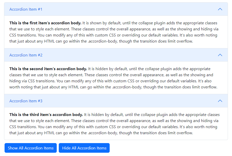
<Button Color="ButtonColor.Primary" @onclick="ShowAllAccordionItemsAsync">Show All Accordion Items</Button>
<Button Color="ButtonColor.Primary" @onclick="HideAllAccordionItemsAsync">Hide All Accordion Items</Button>
@code {
    private Accordion accordion1 = default!;

    private Task ShowAllAccordionItemsAsync() => accordion1.ShowAllAccordionItemsAsync();
    private Task HideAllAccordionItemsAsync() => accordion1.HideAllAccordionItemsAsync();
}
Events Example
Blazor Bootstrap Accordion component exposes a few events for hooking into accordion functionality.
<Accordion @ref="accordion1"
           OnShowing="OnShowingAsync"
           OnShown="OnShownAsync"
           OnHiding="OnHidingAsync"
           OnHidden="OnHiddenAsync">
    <AccordionItem Title="Accordion Item #1" Name="AccordionItem1">
        <Content>
            <b>This is the first item's accordion body.</b> It is shown by default, until the collapse plugin adds the appropriate classes that we use to style each element. These classes control the overall appearance, as well as the showing and hiding via CSS transitions. You can modify any of this with custom CSS or overriding our default variables. It's also worth noting that just about any HTML can go within the .accordion-body, though the transition does limit overflow.
        </Content>
    </AccordionItem>
    <AccordionItem Title="Accordion Item #2" Name="AccordionItem2">
        <Content>
            <b>This is the second item's accordion body.</b> It is hidden by default, until the collapse plugin adds the appropriate classes that we use to style each element. These classes control the overall appearance, as well as the showing and hiding via CSS transitions. You can modify any of this with custom CSS or overriding our default variables. It's also worth noting that just about any HTML can go within the .accordion-body, though the transition does limit overflow.
        </Content>
    </AccordionItem>
    <AccordionItem Title="Accordion Item #3" Name="AccordionItem3">
        <Content>
            <b>This is the third item's accordion body.</b> It is hidden by default, until the collapse plugin adds the appropriate classes that we use to style each element. These classes control the overall appearance, as well as the showing and hiding via CSS transitions. You can modify any of this with custom CSS or overriding our default variables. It's also worth noting that just about any HTML can go within the .accordion-body, though the transition does limit overflow.
        </Content>
    </AccordionItem>
</Accordion>
@code {
    private Accordion accordion1 = default!;

    [Inject] ToastService ToastService { get; set; } = default!;

    private void OnShowingAsync(AccordionEventArgs args)
    {
        ToastService.Notify(new ToastMessage(
            type: ToastType.Primary,
            message: $"Event Name: Showing, AccordionItemName: {args.Name}, AccordionItemTitle: {args.Title}"));
    }

    private void OnShownAsync(AccordionEventArgs args)
    {
        ToastService.Notify(new ToastMessage(
            type: ToastType.Primary,
            message: $"Event Name: OnShown, AccordionItemName: {args.Name}, AccordionItemTitle: {args.Title}"));
    }

    private void OnHidingAsync(AccordionEventArgs args)
    {
        ToastService.Notify(new ToastMessage(
            type: ToastType.Primary,
            message: $"Event Name: OnHiding, AccordionItemName: {args.Name}, AccordionItemTitle: {args.Title}"));
    }

    private void OnHiddenAsync(AccordionEventArgs args)
    {
        ToastService.Notify(new ToastMessage(
            type: ToastType.Primary,
            message: $"Event Name: OnHidden, AccordionItemName: {args.Name}, AccordionItemTitle: {args.Title}"));
    }
}