Blazor Dropdown
Dropdowns are toggleable, contextual overlays for displaying lists of links and more. They are toggled by clicking, not by hovering; this is an intentional design decision'by bootstrap.
Dropdown Parameters
| Name | Type | Default | Required | Description | Added Version |
|---|---|---|---|---|---|
| AutoClose | bool | true | If true, enables the auto close. | 1.10.0 | |
| AutoCloseBehavior | DropdownAutoCloseBehavior | DropdownAutoCloseBehavior.Both | Gets or sets the auto close behavior of the dropdown. | 1.10.0 | |
| ChildContent | RenderFragment | null | ✔️ | Gets or sets the content to be rendered within the component. | 1.10.0 |
| Color | DropdownColor | DropdownColor.None | Gets or sets the dropdown color. | 3.0.0 | |
| Direction | DropdownDirection | DropdownDirection.Dropdown | Gets or sets the direction of the dropdown menu. | 1.10.0 | |
| Disabled | bool | false | If true, dropdown will be disabled. | 1.10.3 | |
| Size | DropdownSize | DropdownSize.None | Gets or sets the size of the dropdown. | 1.10.3 | |
| Split | bool | false | Gets or sets the toggle button split behavior. | 1.10.0 |
DropdownToggleButton Parameters
| Name | Type | Default | Required | Description | Added Version |
|---|---|---|---|---|---|
| ChildContent | RenderFragment | null | ✔️ | Gets or sets the content to be rendered within the component. | 1.10.0 |
| TabIndex | int? | null | Gets or sets the dropdown toggle button tab index. | 1.10.0 |
DropdownActionButton Parameters
| Name | Type | Default | Required | Description | Added Version |
|---|---|---|---|---|---|
| ChildContent | RenderFragment | null | ✔️ | Gets or sets the content to be rendered within the component. | 1.10.0 |
| Color | ButtonColor | Gets or sets the button color. | 1.10.0 | ||
| TabIndex | int? | If defined, indicates that its element can be focused and can participates in sequential keyboard navigation. | 1.10.0 |
DropdownMenu Parameters
| Name | Type | Default | Required | Description | Added Version |
|---|---|---|---|---|---|
| ChildContent | RenderFragment | null | ✔️ | Gets or sets the content to be rendered within the component. | 1.10.0 |
| Position | DropdownMenuPosition | DropdownMenuPosition.Start | Gets or sets the dropdown menu position. | 1.10.0 |
DropdownHeader Parameters
| Name | Type | Default | Required | Description | Added Version |
|---|---|---|---|---|---|
| ChildContent | RenderFragment | null | ✔️ | Gets or sets the content to be rendered within the component. | 1.10.0 |
DropdownItem Parameters
| Name | Type | Default | Required | Description | Added Version |
|---|---|---|---|---|---|
| Active | bool | false | Gets or sets the dropdown item active state. | 1.10.0 | |
| ChildContent | RenderFragment | null | ✔️ | Gets or sets the content to be rendered within the component. | 1.10.0 |
| Disabled | bool | false | If true, dropdown item will be disabled. | 1.10.0 | |
| TabIndex | int? | null | Gets or sets the dropdown item tab index. | 1.10.0 | |
| Target | Target | Target.None | Gets or sets the target of dropdown item (if the type is link). | 1.10.0 | |
| To | string? | null | Get or sets the link href attribute (if the type is link). | 1.10.0 | |
| Type | DropdownItemType | DropdownItemType.Button | Gets or sets the dropdown item type. | 1.10.0 |
Dropdown Methods
| Name | Description | Added Version |
|---|---|---|
| HideAsync | Hides the dropdown menu of a given navbar or tabbed navigation. | 1.10.0 |
| ShowAsync | Shows the dropdown menu of a given navbar or tabbed navigation. | 1.10.0 |
| ToggleAsync | Toggles the dropdown menu of a given navbar or tabbed navigation. | 1.10.0 |
| UpdateAsync | Updates the position of an element’s dropdown. | 1.10.0 |
Dropdown Events
| Event Type | Description | Added Version |
|---|---|---|
| OnHiding | This event is fired immediately when the hide method has been called. | 1.10.0 |
| OnHidden | This event is fired when an dropdown element has been hidden from the user (will wait for CSS transitions to complete). | 1.10.0 |
| OnShowing | This event fires immediately when the show instance method is called. | 1.10.0 |
| OnShown | This event is fired when an dropdown element has been made visible to the user (will wait for CSS transitions to complete). | 1.10.0 |
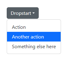
Examples
Single button
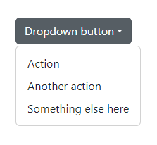
<Dropdown Color="DropdownColor.Secondary">
    <DropdownToggleButton>Dropdown button</DropdownToggleButton>
    <DropdownMenu>
        <DropdownItem To="#" Type="DropdownItemType.Link">Action</DropdownItem>
        <DropdownItem To="#" Type="DropdownItemType.Link">Another action</DropdownItem>
        <DropdownItem To="#" Type="DropdownItemType.Link">Something else here</DropdownItem>
    </DropdownMenu>
</Dropdown>
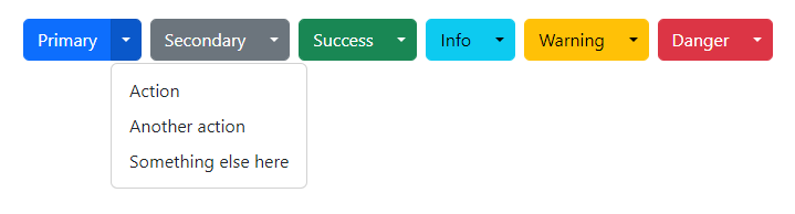
Color
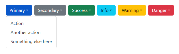
<div class="d-flex gap-2 mb-4">
    <Dropdown Color="DropdownColor.Primary">
        <DropdownToggleButton>Primary</DropdownToggleButton>
        <DropdownMenu>
            <DropdownItem To="#" Type="DropdownItemType.Link">Action</DropdownItem>
            <DropdownItem To="#" Type="DropdownItemType.Link">Another action</DropdownItem>
            <DropdownItem To="#" Type="DropdownItemType.Link">Something else here</DropdownItem>
        </DropdownMenu>
    </Dropdown>

    <Dropdown Color="DropdownColor.Secondary">
        <DropdownToggleButton>Secondary</DropdownToggleButton>
        <DropdownMenu>
            <DropdownItem To="#" Type="DropdownItemType.Link">Action</DropdownItem>
            <DropdownItem To="#" Type="DropdownItemType.Link">Another action</DropdownItem>
            <DropdownItem To="#" Type="DropdownItemType.Link">Something else here</DropdownItem>
        </DropdownMenu>
    </Dropdown>

    <Dropdown Color="DropdownColor.Success">
        <DropdownToggleButton>Success</DropdownToggleButton>
        <DropdownMenu>
            <DropdownItem To="#" Type="DropdownItemType.Link">Action</DropdownItem>
            <DropdownItem To="#" Type="DropdownItemType.Link">Another action</DropdownItem>
            <DropdownItem To="#" Type="DropdownItemType.Link">Something else here</DropdownItem>
        </DropdownMenu>
    </Dropdown>

    <Dropdown Color="DropdownColor.Info">
        <DropdownToggleButton>Info</DropdownToggleButton>
        <DropdownMenu>
            <DropdownItem To="#" Type="DropdownItemType.Link">Action</DropdownItem>
            <DropdownItem To="#" Type="DropdownItemType.Link">Another action</DropdownItem>
            <DropdownItem To="#" Type="DropdownItemType.Link">Something else here</DropdownItem>
        </DropdownMenu>
    </Dropdown>

    <Dropdown Color="DropdownColor.Warning">
        <DropdownToggleButton>Warning</DropdownToggleButton>
        <DropdownMenu>
            <DropdownItem To="#" Type="DropdownItemType.Link">Action</DropdownItem>
            <DropdownItem To="#" Type="DropdownItemType.Link">Another action</DropdownItem>
            <DropdownItem To="#" Type="DropdownItemType.Link">Something else here</DropdownItem>
        </DropdownMenu>
    </Dropdown>

    <Dropdown Color="DropdownColor.Danger">
        <DropdownToggleButton>Danger</DropdownToggleButton>
        <DropdownMenu>
            <DropdownItem To="#" Type="DropdownItemType.Link">Action</DropdownItem>
            <DropdownItem To="#" Type="DropdownItemType.Link">Another action</DropdownItem>
            <DropdownItem To="#" Type="DropdownItemType.Link">Something else here</DropdownItem>
        </DropdownMenu>
    </Dropdown>
</div>
Split button
<div class="d-flex gap-2 mb-4">
    <Dropdown Color="DropdownColor.Primary" Split="true">
        <DropdownActionButton>Primary</DropdownActionButton>
        <DropdownToggleButton />
        <DropdownMenu>
            <DropdownItem To="#" Type="DropdownItemType.Link">Action</DropdownItem>
            <DropdownItem To="#" Type="DropdownItemType.Link">Another action</DropdownItem>
            <DropdownItem To="#" Type="DropdownItemType.Link">Something else here</DropdownItem>
        </DropdownMenu>
    </Dropdown>

    <Dropdown Color="DropdownColor.Secondary" Split="true">
        <DropdownActionButton>Secondary</DropdownActionButton>
        <DropdownToggleButton />
        <DropdownMenu>
            <DropdownItem To="#" Type="DropdownItemType.Link">Action</DropdownItem>
            <DropdownItem To="#" Type="DropdownItemType.Link">Another action</DropdownItem>
            <DropdownItem To="#" Type="DropdownItemType.Link">Something else here</DropdownItem>
        </DropdownMenu>
    </Dropdown>

    <Dropdown Color="DropdownColor.Success" Split="true">
        <DropdownActionButton>Success</DropdownActionButton>
        <DropdownToggleButton />
        <DropdownMenu>
            <DropdownItem To="#" Type="DropdownItemType.Link">Action</DropdownItem>
            <DropdownItem To="#" Type="DropdownItemType.Link">Another action</DropdownItem>
            <DropdownItem To="#" Type="DropdownItemType.Link">Something else here</DropdownItem>
        </DropdownMenu>
    </Dropdown>

    <Dropdown Color="DropdownColor.Info" Split="true">
        <DropdownActionButton>Info</DropdownActionButton>
        <DropdownToggleButton />
        <DropdownMenu>
            <DropdownItem To="#" Type="DropdownItemType.Link">Action</DropdownItem>
            <DropdownItem To="#" Type="DropdownItemType.Link">Another action</DropdownItem>
            <DropdownItem To="#" Type="DropdownItemType.Link">Something else here</DropdownItem>
        </DropdownMenu>
    </Dropdown>

    <Dropdown Color="DropdownColor.Warning" Split="true">
        <DropdownActionButton>Warning</DropdownActionButton>
        <DropdownToggleButton />
        <DropdownMenu>
            <DropdownItem To="#" Type="DropdownItemType.Link">Action</DropdownItem>
            <DropdownItem To="#" Type="DropdownItemType.Link">Another action</DropdownItem>
            <DropdownItem To="#" Type="DropdownItemType.Link">Something else here</DropdownItem>
        </DropdownMenu>
    </Dropdown>

    <Dropdown Color="DropdownColor.Danger" Split="true">
        <DropdownActionButton>Danger</DropdownActionButton>
        <DropdownToggleButton />
        <DropdownMenu>
            <DropdownItem To="#" Type="DropdownItemType.Link">Action</DropdownItem>
            <DropdownItem To="#" Type="DropdownItemType.Link">Another action</DropdownItem>
            <DropdownItem To="#" Type="DropdownItemType.Link">Something else here</DropdownItem>
        </DropdownMenu>
    </Dropdown>
</div>
Sizing
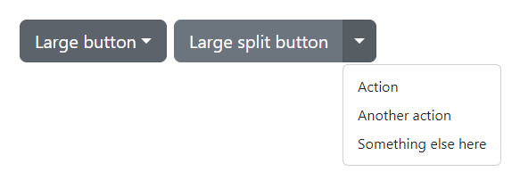
<div class="d-flex gap-2 mb-4">
    <Dropdown Color="DropdownColor.Secondary" Size="DropdownSize.Large">
        <DropdownToggleButton>Large button</DropdownToggleButton>
        <DropdownMenu>
            <DropdownItem To="#" Type="DropdownItemType.Link">Action</DropdownItem>
            <DropdownItem To="#" Type="DropdownItemType.Link">Another action</DropdownItem>
            <DropdownItem To="#" Type="DropdownItemType.Link">Something else here</DropdownItem>
        </DropdownMenu>
    </Dropdown>

    <Dropdown Color="DropdownColor.Secondary" Split="true" Size="DropdownSize.Large">
        <DropdownActionButton>Large split button</DropdownActionButton>
        <DropdownToggleButton />
        <DropdownMenu>
            <DropdownItem To="#" Type="DropdownItemType.Link">Action</DropdownItem>
            <DropdownItem To="#" Type="DropdownItemType.Link">Another action</DropdownItem>
            <DropdownItem To="#" Type="DropdownItemType.Link">Something else here</DropdownItem>
        </DropdownMenu>
    </Dropdown>
</div>
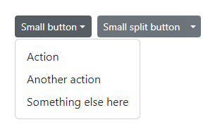
<div class="d-flex gap-2 mb-4">
    <Dropdown Color="DropdownColor.Secondary" Size="DropdownSize.Small">
        <DropdownToggleButton>Small button</DropdownToggleButton>
        <DropdownMenu>
            <DropdownItem To="#" Type="DropdownItemType.Link">Action</DropdownItem>
            <DropdownItem To="#" Type="DropdownItemType.Link">Another action</DropdownItem>
            <DropdownItem To="#" Type="DropdownItemType.Link">Something else here</DropdownItem>
        </DropdownMenu>
    </Dropdown>

    <Dropdown Color="DropdownColor.Secondary" Size="DropdownSize.Small" Split="true">
        <DropdownActionButton>Small split button</DropdownActionButton>
        <DropdownToggleButton />
        <DropdownMenu>
            <DropdownItem To="#" Type="DropdownItemType.Link">Action</DropdownItem>
            <DropdownItem To="#" Type="DropdownItemType.Link">Another action</DropdownItem>
            <DropdownItem To="#" Type="DropdownItemType.Link">Something else here</DropdownItem>
        </DropdownMenu>
    </Dropdown>
</div>
Directions
Dropup
To trigger DropdownMenu above elements, add the Direction="DropdownDirection.Dropup" to the Dropdown component.
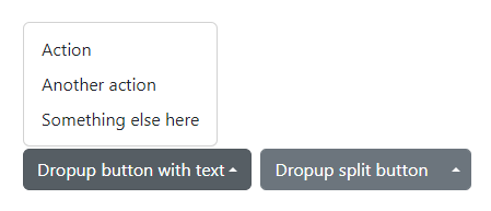
<div class="d-flex gap-2">
    <Dropdown Color="DropdownColor.Secondary" Direction="DropdownDirection.Dropup">
        <DropdownToggleButton>Dropup button with text</DropdownToggleButton>
        <DropdownMenu>
            <DropdownItem To="#" Type="DropdownItemType.Link">Action</DropdownItem>
            <DropdownItem To="#" Type="DropdownItemType.Link">Another action</DropdownItem>
            <DropdownItem To="#" Type="DropdownItemType.Link">Something else here</DropdownItem>
        </DropdownMenu>
    </Dropdown>

    <Dropdown Color="DropdownColor.Secondary" Direction="DropdownDirection.Dropup" Split="true">
        <DropdownActionButton>Dropup split button</DropdownActionButton>
        <DropdownToggleButton />
        <DropdownMenu>
            <DropdownItem To="#" Type="DropdownItemType.Link">Action</DropdownItem>
            <DropdownItem To="#" Type="DropdownItemType.Link">Another action</DropdownItem>
            <DropdownItem To="#" Type="DropdownItemType.Link">Something else here</DropdownItem>
        </DropdownMenu>
    </Dropdown>
</div>
Dropup centered
To center the DropdownMenu above the toggle, add the Direction="DropdownDirection.DropupCentered" to the Dropdown component.
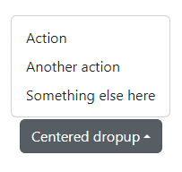
<div class="d-flex gap-2">
    <Dropdown Color="DropdownColor.Secondary" Direction="DropdownDirection.DropupCentered">
        <DropdownToggleButton>Centered dropup</DropdownToggleButton>
        <DropdownMenu>
            <DropdownItem To="#" Type="DropdownItemType.Link">Action</DropdownItem>
            <DropdownItem To="#" Type="DropdownItemType.Link">Another action</DropdownItem>
            <DropdownItem To="#" Type="DropdownItemType.Link">Something else here</DropdownItem>
        </DropdownMenu>
    </Dropdown>
</div>
Dropend
To trigger DropdownMenu at the right of elements, add the Direction="DropdownDirection.Dropend" to the Dropdown component.
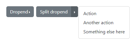
<div class="d-flex gap-2">
    <Dropdown Color="DropdownColor.Secondary" Direction="DropdownDirection.Dropend">
        <DropdownToggleButton>Dropend</DropdownToggleButton>
        <DropdownMenu>
            <DropdownItem To="#" Type="DropdownItemType.Link">Action</DropdownItem>
            <DropdownItem To="#" Type="DropdownItemType.Link">Another action</DropdownItem>
            <DropdownItem To="#" Type="DropdownItemType.Link">Something else here</DropdownItem>
        </DropdownMenu>
    </Dropdown>

    <Dropdown Color="DropdownColor.Secondary" Direction="DropdownDirection.Dropend" Split="true">
        <DropdownActionButton>Split dropend</DropdownActionButton>
        <DropdownToggleButton />
        <DropdownMenu>
            <DropdownItem To="#" Type="DropdownItemType.Link">Action</DropdownItem>
            <DropdownItem To="#" Type="DropdownItemType.Link">Another action</DropdownItem>
            <DropdownItem To="#" Type="DropdownItemType.Link">Something else here</DropdownItem>
        </DropdownMenu>
    </Dropdown>
</div>
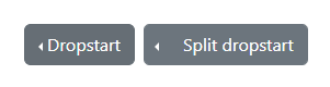
Dropstart
To trigger DropdownMenu at the left of elements, you can add the Direction="DropdownDirection.Dropstart" to the Dropdown component.
<div class="d-flex gap-2">
    <Dropdown Color="DropdownColor.Secondary" Direction="DropdownDirection.Dropstart">
        <DropdownToggleButton>Dropstart</DropdownToggleButton>
        <DropdownMenu>
            <DropdownItem To="#" Type="DropdownItemType.Link">Action</DropdownItem>
            <DropdownItem To="#" Type="DropdownItemType.Link">Another action</DropdownItem>
            <DropdownItem To="#" Type="DropdownItemType.Link">Something else here</DropdownItem>
        </DropdownMenu>
    </Dropdown>
    <Dropdown Color="DropdownColor.Secondary" Direction="DropdownDirection.Dropstart" Split="true">
        <DropdownToggleButton />
        <DropdownMenu>
            <DropdownItem To="#" Type="DropdownItemType.Link">Action</DropdownItem>
            <DropdownItem To="#" Type="DropdownItemType.Link">Another action</DropdownItem>
            <DropdownItem To="#" Type="DropdownItemType.Link">Something else here</DropdownItem>
        </DropdownMenu>
        <DropdownActionButton>Split dropstart</DropdownActionButton>
    </Dropdown>
</div>
Active
To style DropdownItem as active, add the Active="true" parameter to the DropdownItem element in the DropdownMenu.
<Dropdown Color="DropdownColor.Secondary">
    <DropdownToggleButton>Dropstart</DropdownToggleButton>
    <DropdownMenu>
        <DropdownItem To="#" Type="DropdownItemType.Link">Action</DropdownItem>
        <DropdownItem To="#" Type="DropdownItemType.Link" Active="true">Another action</DropdownItem>
        <DropdownItem To="#" Type="DropdownItemType.Link">Something else here</DropdownItem>
    </DropdownMenu>
</Dropdown>
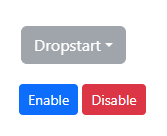
Disabled
To disable the dropdown, set the Disabled parameter to true on the Dropdown component.
<Dropdown Color="DropdownColor.Secondary" Disabled="@isDropdownDisabled">
    <DropdownToggleButton>Dropstart</DropdownToggleButton>
    <DropdownMenu>
        <DropdownItem To="#" Type="DropdownItemType.Link">Action</DropdownItem>
        <DropdownItem To="#" Type="DropdownItemType.Link">Another action</DropdownItem>
        <DropdownItem To="#" Type="DropdownItemType.Link">Something else here</DropdownItem>
    </DropdownMenu>
</Dropdown>

<div class="mt-3">
    <Button Color="ButtonColor.Primary" Size="ButtonSize.Small" @onclick="EnableDropdown">Enable</Button>
    <Button Color="ButtonColor.Danger" Size="ButtonSize.Small" @onclick="DisableDropdown">Disable</Button>
</div>
@code
{
    private bool isDropdownDisabled = true;
    private void EnableDropdown() => isDropdownDisabled = false;
    private void DisableDropdown() => isDropdownDisabled = true;
}
To style a dropdown item as disabled, set the Disabled parameter to true on the DropdownItem element in the DropdownMenu component.
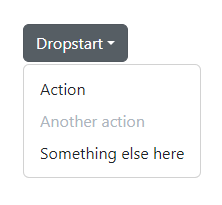
<Dropdown Color="DropdownColor.Secondary">
    <DropdownToggleButton>Dropstart</DropdownToggleButton>
    <DropdownMenu>
        <DropdownItem To="#" Type="DropdownItemType.Link">Action</DropdownItem>
        <DropdownItem To="#" Type="DropdownItemType.Link" Disabled="true">Another action</DropdownItem>
        <DropdownItem To="#" Type="DropdownItemType.Link">Something else here</DropdownItem>
    </DropdownMenu>
</Dropdown>
Menu position
By default, a DropdownMenu is automatically positioned at 100% from the top and along the left side of its parent. You can change this with the Position parameter.
To right-align a DropdownMenu, add the Position="DropdownMenuPosition.End" parameter to the DropdownMenu component. Directions are mirrored when using Bootstrap in RTL.
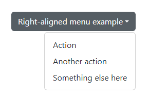
<Dropdown Color="DropdownColor.Secondary">
    <DropdownToggleButton>Right-aligned menu example</DropdownToggleButton>
    <DropdownMenu Position="DropdownMenuPosition.End">
        <DropdownItem To="#" Type="DropdownItemType.Link">Action</DropdownItem>
        <DropdownItem To="#" Type="DropdownItemType.Link">Another action</DropdownItem>
        <DropdownItem To="#" Type="DropdownItemType.Link">Something else here</DropdownItem>
    </DropdownMenu>
</Dropdown>
Menu content
Header
Add a header to label sections of actions in any dropdown menu.
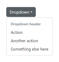
<Dropdown Color="DropdownColor.Secondary">
    <DropdownToggleButton>Dropdown</DropdownToggleButton>
    <DropdownMenu>
        <DropdownHeader>Dropdown header</DropdownHeader>
        <DropdownItem To="#" Type="DropdownItemType.Link">Action</DropdownItem>
        <DropdownItem To="#" Type="DropdownItemType.Link">Another action</DropdownItem>
        <DropdownItem To="#" Type="DropdownItemType.Link">Something else here</DropdownItem>
    </DropdownMenu>
</Dropdown>
Dividers
Separate groups of related menu items with a divider.
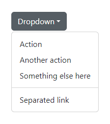
<Dropdown Color="DropdownColor.Secondary">
    <DropdownToggleButton>Dropdown</DropdownToggleButton>
    <DropdownMenu>
        <DropdownItem To="#" Type="DropdownItemType.Link">Action</DropdownItem>
        <DropdownItem To="#" Type="DropdownItemType.Link">Another action</DropdownItem>
        <DropdownItem To="#" Type="DropdownItemType.Link">Something else here</DropdownItem>
        <DropdownDivider>Dropdown header</DropdownDivider>
        <DropdownItem To="#" Type="DropdownItemType.Link">Separated link</DropdownItem>
    </DropdownMenu>
</Dropdown>
Text
Place any freeform text within a dropdown menu with text and use spacing utilities. Note that youll likely need additional sizing styles to constrain the menu width.
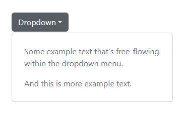
<Dropdown Color="DropdownColor.Secondary">
    <DropdownToggleButton>Dropdown</DropdownToggleButton>
    <DropdownMenu Class="p-4 text-muted" Style="width: 320px;">
        <p>Some example text that's free-flowing within the dropdown menu.</p>
        <p class="mb-0">And this is more example text.</p>
    </DropdownMenu>
</Dropdown>
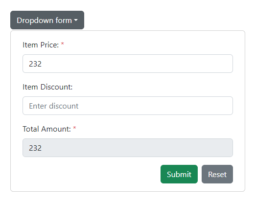
Forms
Put a form within a dropdown menu, or make it into a dropdown menu, and use margin or padding utilities to give it the negative space you require.
@using System.ComponentModel.DataAnnotations

<style>
    .valid.modified:not([type=checkbox]) {
        outline: 1px solid #26b050;
    }

    .invalid {
        outline: 1px solid red;
    }

    .validation-message {
        color: red;
    }
</style>

<Dropdown Color="DropdownColor.Secondary">
    <DropdownToggleButton>Dropdown form</DropdownToggleButton>
    <DropdownMenu Class="px-4 py-3" Style="width:480px;">
        <EditForm EditContext="@editContext" OnValidSubmit="HandleOnValidSubmit">
            <DataAnnotationsValidator />

            <div class="mb-3">
                <label class="form-label">Item Price: <span class="text-danger">*</span></label>
                <NumberInput TValue="decimal?" Value="invoice.Price" ValueExpression="() => invoice.Price" ValueChanged="(value) => PriceChanged(value)" Placeholder="Enter price" />
                <ValidationMessage For="@(() => invoice.Price)" />
            </div>

            <div class="mb-3">
                <label class="form-label">Item Discount:</label>
                <NumberInput TValue="decimal?" Value="invoice.Discount" ValueExpression="() => invoice.Discount" ValueChanged="(value) => DiscountChanged(value)" Placeholder="Enter discount" />
                <ValidationMessage For="@(() => invoice.Discount)" />
            </div>

            <div class="mb-3">
                <label class="form-label">Total Amount: <span class="text-danger">*</span></label>
                <NumberInput TValue="decimal?" @bind-Value="invoice.Total" Disabled="true" Placeholder="Enter total" />
                <ValidationMessage For="@(() => invoice.Total)" />
            </div>

            <div class="row">
                <div class="col-md-12 text-right">
                    <Button Type="ButtonType.Button" Color="ButtonColor.Secondary" Class="float-end" @onclick="ResetForm">Reset</Button>
                    <Button Type="ButtonType.Submit" Color="ButtonColor.Success" Class="float-end me-2">Submit</Button>
                </div>
            </div>
        </EditForm>
    </DropdownMenu>
</Dropdown>
@code {
    private Invoice invoice = new();
    private EditContext editContext = default!;

    protected override void OnInitialized()
    {
        editContext = new EditContext(invoice);
        base.OnInitialized();
    }

    protected override void OnParametersSet()
    {
        CalculateToatl();
        base.OnParametersSet();
    }

    private void PriceChanged(decimal? value)
    {
        invoice.Price = value;
        CalculateToatl();
    }

    private void DiscountChanged(decimal? value)
    {
        invoice.Discount = value;
        CalculateToatl();
    }

    private void CalculateToatl()
    {
        var price = invoice.Price.HasValue ? invoice.Price.Value : 0;
        var discount = invoice.Discount.HasValue ? invoice.Discount.Value : 0;
        invoice.Total = price - discount;
    }

    public void HandleOnValidSubmit()
    {
        Console.WriteLine($"Price: {invoice.Price}");
        Console.WriteLine($"Discount: {invoice.Discount}");
        Console.WriteLine($"Total: {invoice.Total}");
    }

    private void ResetForm()
    {
        invoice = new();
        editContext = new EditContext(invoice);
    }

    public class Invoice
    {
        [Required(ErrorMessage = "Price required.")]
        [Range(60, 500, ErrorMessage = "Price should be between 60 and 500.")]
        public decimal? Price { get; set; } = 232M;

        [Range(0, 50, ErrorMessage = "Discount should be between 0 and 50.")]
        public decimal? Discount { get; set; }

        [Required(ErrorMessage = "Amount required.")]
        [Range(10, 500, ErrorMessage = "Total should be between 60 and 500.")]
        public decimal? Total { get; set; }
    }
}
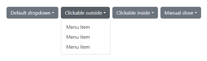
Auto close behavior
By default, the DropdownMenu is closed when clicking either inside or outside the DropdownMenu. You can use the AutoClose and AutoCloseBehavior parameters to change this behavior of the Dropdown.
<Dropdown Color="DropdownColor.Secondary" AutoClose="true">
    <DropdownToggleButton>Default dropdown</DropdownToggleButton>
    <DropdownMenu>
        <DropdownItem To="#" Type="DropdownItemType.Link">Menu item</DropdownItem>
        <DropdownItem To="#" Type="DropdownItemType.Link">Menu item</DropdownItem>
        <DropdownItem To="#" Type="DropdownItemType.Link">Menu item</DropdownItem>
    </DropdownMenu>
</Dropdown>

<Dropdown Color="DropdownColor.Secondary" AutoClose="true" AutoCloseBehavior="DropdownAutoCloseBehavior.Outside">
    <DropdownToggleButton>Clickable outside</DropdownToggleButton>
    <DropdownMenu>
        <DropdownItem To="#" Type="DropdownItemType.Link">Menu item</DropdownItem>
        <DropdownItem To="#" Type="DropdownItemType.Link">Menu item</DropdownItem>
        <DropdownItem To="#" Type="DropdownItemType.Link">Menu item</DropdownItem>
    </DropdownMenu>
</Dropdown>

<Dropdown Color="DropdownColor.Secondary" AutoClose="true" AutoCloseBehavior="DropdownAutoCloseBehavior.Inside">
    <DropdownToggleButton>Clickable inside</DropdownToggleButton>
    <DropdownMenu>
        <DropdownItem To="#" Type="DropdownItemType.Link">Menu item</DropdownItem>
        <DropdownItem To="#" Type="DropdownItemType.Link">Menu item</DropdownItem>
        <DropdownItem To="#" Type="DropdownItemType.Link">Menu item</DropdownItem>
    </DropdownMenu>
</Dropdown>

<Dropdown Color="DropdownColor.Secondary" AutoClose="false">
    <DropdownToggleButton>Manual close</DropdownToggleButton>
    <DropdownMenu>
        <DropdownItem To="#" Type="DropdownItemType.Link">Menu item</DropdownItem>
        <DropdownItem To="#" Type="DropdownItemType.Link">Menu item</DropdownItem>
        <DropdownItem To="#" Type="DropdownItemType.Link">Menu item</DropdownItem>
    </DropdownMenu>
</Dropdown>
Methods
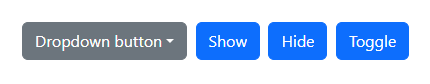
<Dropdown @ref="dropdown1" Color="DropdownColor.Secondary">
    <DropdownToggleButton>Dropdown button</DropdownToggleButton>
    <DropdownMenu>
        <DropdownItem To="#" Type="DropdownItemType.Link">Action</DropdownItem>
        <DropdownItem To="#" Type="DropdownItemType.Link">Another action</DropdownItem>
        <DropdownItem To="#" Type="DropdownItemType.Link">Something else here</DropdownItem>
    </DropdownMenu>
</Dropdown>

<Button Color="ButtonColor.Primary" @onclick="ShowAsync">Show</Button>
<Button Color="ButtonColor.Primary" @onclick="HideAsync">Hide</Button>
<Button Color="ButtonColor.Primary" @onclick="ToggleAsync">Toggle</Button>
@code{
    private Dropdown dropdown1 = default!;

    private async Task ShowAsync() => await dropdown1.ShowAsync();
    private async Task HideAsync() => await dropdown1.HideAsync();
    private async Task ToggleAsync() => await dropdown1.ToggleAsync();
}
Events
All dropdown events are fired at the toggling element and then bubbled up.
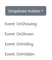
<Dropdown Color="DropdownColor.Secondary"
          OnHiding="OnDropdownHidingAsync"
          OnHidden="OnDropdownHiddenAsync"
          OnShowing="OnDropdownShowingAsync"
          OnShown="OnDropdownShownAsync">
    <DropdownToggleButton>Dropdown button</DropdownToggleButton>
    <DropdownMenu>
        <DropdownItem To="#" Type="DropdownItemType.Link">Action</DropdownItem>
        <DropdownItem To="#" Type="DropdownItemType.Link">Another action</DropdownItem>
        <DropdownItem To="#" Type="DropdownItemType.Link">Something else here</DropdownItem>
    </DropdownMenu>
</Dropdown>

<div class="mt-3">
    @foreach (var item in messages)
    {
        <p>Event: @item</p>
    }
</div>
@code {
    List<string> messages = new List<string>();

    private void OnDropdownHidingAsync() => messages.Add(new("OnHiding"));

    private void OnDropdownHiddenAsync() => messages.Add(new("OnHidden"));

    private void OnDropdownShowingAsync() => messages.Add(new("OnShowing"));

    private void OnDropdownShownAsync() => messages.Add(new("OnShown"));
}