Blazor Toasts
Push notifications to your visitors with a toast, a lightweight and easily customizable Blazor Bootstrap toast message.
Blazor Toasts are lightweight notifications designed to mimic the push notifications that mobile and desktop operating systems have popularized. They're built with a flexbox, making it easy to align and position.

Things to know when using the blazor toasts component:
- Toasts will not hide automatically if you do not specify
AutoHide="true". - Use global toasts service for the application instead of page level toasts.
Toasts Parameters
| Name | Type | Default | Required | Description | Added Version |
|---|---|---|---|---|---|
| AutoHide | bool | false | Gets or sets the auto hide state. | 1.0.0 | |
| Delay | int | 5000 | Gets or sets the delay in milliseconds before hiding the toast. | 1.0.0 | |
| Messages | List<ToastMessage> | null | ✔️ | Gets or sets the toast messages. | 1.0.0 |
| Placement | ToastsPlacement | ToastsPlacement.TopRight | Gets or sets the toast placement. | 1.0.0 | |
| ShowCloseButton | bool | true | If true, shows the close button. | 1.0.0 | |
| StackLength | int | 5 | Gets or sets the toast container maximum capacity. | 1.0.0 |
ToastMessage Properties
| Name | Type | Description | Required | Default | Added Version |
|---|---|---|---|---|---|
| AutoHide | bool | Gets or sets the auto hide behavior to a message. | false | 1.9.0 | |
| CustomIconName | string | Gets or sets the custom icon name. | 1.0.0 | ||
| HelpText | string | Gets or sets the help text. | 1.0.0 | ||
| IconName | IconName | Gets or sets the bootstarp icon name. | 1.0.0 | ||
| Id | Guid | Gets the toast id. | 1.0.0 | ||
| Message | string | Gets or sets the toast message. | ✔️ | 1.0.0 | |
| Title | string | Gets or sets the toast''s message title. | 1.0.0 | ||
| Type | ToastType | Gets or sets the type of the toast. | ✔️ | 1.0.0 |
Examples:
Toast
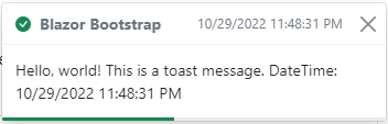
To encourage extensible and predictable toasts, we recommend a header and body.
Toasts are as flexible as you need and have very little required markup. At a minimum, we require a single element to contain your "toasted" content and strongly encourage a dismiss button.
<Toasts class="p-3" Messages="messages" Placement="ToastsPlacement.TopRight" />

<Button Color="ButtonColor.Primary" @onclick="() => ShowMessage(ToastType.Primary)">Primary Toast</Button>
<Button Color="ButtonColor.Secondary" @onclick="() => ShowMessage(ToastType.Secondary)">Secondary Toast</Button>
<Button Color="ButtonColor.Success" @onclick="() => ShowMessage(ToastType.Success)">Success Toast</Button>
<Button Color="ButtonColor.Danger" @onclick="() => ShowMessage(ToastType.Danger)">Danger Toast</Button>
<Button Color="ButtonColor.Warning" @onclick="() => ShowMessage(ToastType.Warning)">Warning Toast</Button>
<Button Color="ButtonColor.Info" @onclick="() => ShowMessage(ToastType.Info)">Info Toast</Button>
<Button Color="ButtonColor.Dark" @onclick="() => ShowMessage(ToastType.Dark)">Dark Toast</Button>
@code {
    List<ToastMessage> messages = new List<ToastMessage>();

    private void ShowMessage(ToastType toastType) => messages.Add(CreateToastMessage(toastType));

    private ToastMessage CreateToastMessage(ToastType toastType)
    => new ToastMessage
        {
            Type = toastType,
            Title = "Blazor Bootstrap",
            HelpText = $"{DateTime.Now}",
            Message = $"Hello, world! This is a toast message. DateTime: {DateTime.Now}",
        };
}
Toast without title
Customize your toasts by removing sub-components, tweaking them with utilities.
Here we've created a simple toast. You can create different toast color schemes with the Color parameter.


<Toasts class="p-3" Messages="messages" Placement="ToastsPlacement.TopRight" />

<Button Color="ButtonColor.Primary" @onclick="() => ShowMessage(ToastType.Primary)">Primary Toast</Button>
<Button Color="ButtonColor.Secondary" @onclick="() => ShowMessage(ToastType.Secondary)">Secondary Toast</Button>
<Button Color="ButtonColor.Success" @onclick="() => ShowMessage(ToastType.Success)">Success Toast</Button>
<Button Color="ButtonColor.Danger" @onclick="() => ShowMessage(ToastType.Danger)">Danger Toast</Button>
<Button Color="ButtonColor.Warning" @onclick="() => ShowMessage(ToastType.Warning)">Warning Toast</Button>
<Button Color="ButtonColor.Info" @onclick="() => ShowMessage(ToastType.Info)">Info Toast</Button>
<Button Color="ButtonColor.Light" @onclick="() => ShowMessage(ToastType.Light)">Light Toast</Button>
<Button Color="ButtonColor.Dark" @onclick="() => ShowMessage(ToastType.Dark)">Dark Toast</Button>
@code {
    List<ToastMessage> messages = new List<ToastMessage>();

    private void ShowMessage(ToastType toastType) => messages.Add(CreateToastMessage(toastType));

    private ToastMessage CreateToastMessage(ToastType toastType)
    => new ToastMessage
        {
            Type = toastType,
            Message = $"Hello, world! This is a simple toast message. DateTime: {DateTime.Now}",
        };
}
See toasts without title demo here.
Auto hide
Add AutoHide="true" parameter to hide the Blazor Toasts after the delay. The default delay is 5000 milliseconds, be sure to update the delay timeout so that users have enough time to read the toast.
<Toasts class="p-3" Messages="messages" AutoHide="true" Delay="6000" Placement="ToastsPlacement.TopRight" />

<Button Color="ButtonColor.Primary" @onclick="() => ShowMessage(ToastType.Primary)">Primary Toast</Button>
<Button Color="ButtonColor.Secondary" @onclick="() => ShowMessage(ToastType.Secondary)">Secondary Toast</Button>
<Button Color="ButtonColor.Success" @onclick="() => ShowMessage(ToastType.Success)">Success Toast</Button>
<Button Color="ButtonColor.Danger" @onclick="() => ShowMessage(ToastType.Danger)">Danger Toast</Button>
<Button Color="ButtonColor.Warning" @onclick="() => ShowMessage(ToastType.Warning)">Warning Toast</Button>
<Button Color="ButtonColor.Info" @onclick="() => ShowMessage(ToastType.Info)">Info Toast</Button>
<Button Color="ButtonColor.Dark" @onclick="() => ShowMessage(ToastType.Dark)">Dark Toast</Button>
@code {
    List<ToastMessage> messages = new List<ToastMessage>();

    private void ShowMessage(ToastType toastType) => messages.Add(CreateToastMessage(toastType));

    private ToastMessage CreateToastMessage(ToastType toastType)
    => new ToastMessage
        {
            Type = toastType,
            Title = "Blazor Bootstrap",
            HelpText = $"{DateTime.Now}",
            Message = $"Hello, world! This is a toast message. DateTime: {DateTime.Now}",
        };
}
See auto hide toasts demo here.
Auto hide individual messages
Set AutoHide="true" property on ToastMessage to hide individual Blazor Toast message after the delay. The default delay is 5000 milliseconds, be sure to update the delay timeout so that users have enough time to read the toast.
In the below example, AutoHide="false" for Danger and Warning messages.
<Toasts class="p-3" Messages="messages" Delay="6000" Placement="ToastsPlacement.TopRight" />

<Button Color="ButtonColor.Primary" @onclick="() => ShowMessage(ToastType.Primary)">Primary Toast</Button>
<Button Color="ButtonColor.Secondary" @onclick="() => ShowMessage(ToastType.Secondary)">Secondary Toast</Button>
<Button Color="ButtonColor.Success" @onclick="() => ShowMessage(ToastType.Success)">Success Toast</Button>
<Button Color="ButtonColor.Danger" @onclick="() => ShowMessage(ToastType.Danger)">Danger Toast</Button>
<Button Color="ButtonColor.Warning" @onclick="() => ShowMessage(ToastType.Warning)">Warning Toast</Button>
<Button Color="ButtonColor.Info" @onclick="() => ShowMessage(ToastType.Info)">Info Toast</Button>
<Button Color="ButtonColor.Dark" @onclick="() => ShowMessage(ToastType.Dark)">Dark Toast</Button>
@code {
    List<ToastMessage> messages = new List<ToastMessage>();

    private void ShowMessage(ToastType toastType) => messages.Add(CreateToastMessage(toastType));

    private ToastMessage CreateToastMessage(ToastType toastType)
    {
        var toastMessage = new ToastMessage();

        toastMessage.Type = toastType;
        toastMessage.Title = "Blazor Bootstrap";
        toastMessage.HelpText = $"{DateTime.Now}";
        toastMessage.Message = $"Hello, world! This is a toast message. DateTime: {DateTime.Now}";
        // disable auto hide for `danger` and `warning` messages.
        toastMessage.AutoHide = !(toastType == ToastType.Danger || toastType == ToastType.Warning);

        return toastMessage;
    }
}
See auto hide individual toasts demo here.
Placement
Change the Blazor Toasts placement according to your need. The default placement will be top right corner. Use the ToastsPlacement parameter to update the Blazor Toasts placement.
<Toasts class="p-3" Messages="messages" Placement="@toastsPlacement" />

<Button Color="ButtonColor.Secondary" @onclick="() => ChangePlacement(ToastsPlacement.TopLeft)">Top Left</Button>
<Button Color="ButtonColor.Secondary" @onclick="() => ChangePlacement(ToastsPlacement.TopCenter)">Top Center</Button>
<Button Color="ButtonColor.Secondary" @onclick="() => ChangePlacement(ToastsPlacement.TopRight)">Top Right</Button>
<Button Color="ButtonColor.Secondary" @onclick="() => ChangePlacement(ToastsPlacement.MiddleLeft)">Middle Left</Button>
<Button Color="ButtonColor.Secondary" @onclick="() => ChangePlacement(ToastsPlacement.MiddleCenter)">Middle Center</Button>
<Button Color="ButtonColor.Secondary" @onclick="() => ChangePlacement(ToastsPlacement.MiddleRight)">Middle Right</Button>
<Button Color="ButtonColor.Secondary" @onclick="() => ChangePlacement(ToastsPlacement.BottomLeft)">Bottom Left</Button>
<Button Color="ButtonColor.Secondary" @onclick="() => ChangePlacement(ToastsPlacement.BottomCenter)">Bottom Center</Button>
<Button Color="ButtonColor.Secondary" @onclick="() => ChangePlacement(ToastsPlacement.BottomRight)">Bottom Right</Button>
@code {
    ToastsPlacement toastsPlacement = ToastsPlacement.TopRight;
    List<ToastMessage> messages = new();

    private void ChangePlacement(ToastsPlacement placement)
    {
        if (!messages.Any())
        {
            messages.Add(
                new ToastMessage()
                    {
                        Type = ToastType.Success,
                        Title = "Blazor Bootstrap",
                        HelpText = $"{DateTime.Now}",
                        Message = $"Hello, world! This is a toast message. DateTime: {DateTime.Now}",
                    });
        }
        toastsPlacement = placement;
    }
}
Stack Length
Blazor Toasts component shows a maximum of 5 toasts by default. If you add a new toast to the existing list, the first toast gets deleted like FIFO (First In First Out). Change the maximum capacity according to your need by using the StackLength parameter.
In the below example, StackLength is set to 3. It shows a maximum of 3 toast messages at any time.
<Toasts class="p-3" Messages="messages" AutoHide="true" StackLength="3" Placement="ToastsPlacement.TopRight" />

<Button Color="ButtonColor.Primary" @onclick="() => ShowMessage(ToastType.Primary)">Primary Toast</Button>
<Button Color="ButtonColor.Secondary" @onclick="() => ShowMessage(ToastType.Secondary)">Secondary Toast</Button>
<Button Color="ButtonColor.Success" @onclick="() => ShowMessage(ToastType.Success)">Success Toast</Button>
<Button Color="ButtonColor.Danger" @onclick="() => ShowMessage(ToastType.Danger)">Danger Toast</Button>
<Button Color="ButtonColor.Warning" @onclick="() => ShowMessage(ToastType.Warning)">Warning Toast</Button>
<Button Color="ButtonColor.Info" @onclick="() => ShowMessage(ToastType.Info)">Info Toast</Button>
<Button Color="ButtonColor.Dark" @onclick="() => ShowMessage(ToastType.Dark)">Dark Toast</Button>
@code {
    List<ToastMessage> messages = new List<ToastMessage>();

    private void ShowMessage(ToastType toastType) => messages.Add(CreateToastMessage(toastType));

    private ToastMessage CreateToastMessage(ToastType toastType)
    => new ToastMessage
        {
            Type = toastType,
            Title = "Blazor Bootstrap",
            HelpText = $"{DateTime.Now}",
            Message = $"Hello, world! This is a toast message. DateTime: {DateTime.Now}",
        };
}
Global toasts service for the application
- Add the
Toastscomponent in MainLayout.razor page as shown below.
@inherits LayoutComponentBase

...

... MainLayour.razor code goes here ...

...

<Toasts class="p-3" AutoHide="true" Delay="4000" Placement="ToastsPlacement.TopRight" />
Set the Toasts component parameters as per your requirement.
- Inject
ToastService, then call theNotify(...)method as shown below.
@code {

    [Inject] protected ToastService ToastService { get; set; }

    private void SaveEmployee()
    {
        try
        {
            // TODO: call the service/api to save the employee details

            ToastService.Notify(new(ToastType.Success, $"Employee details saved successfully."));
        }
        catch(Exception ex)
        {
            // handle exception

            ToastService.Notify(new(ToastType.Danger, $"Error: {ex.Message}."));
        }
    }
}