Blazor Tooltips
Use Blazor Bootstrap tooltip component to add custom tooltips to your web pages.
Parameters
| Name | Type | Description | Required | Default | Added Version |
|---|---|---|---|---|---|
| ChildContent | RenderFragment | null | ✔️ | Gets or sets the content to be rendered within the component. | 1.0.0 |
| Color | TooltipColor | TooltipColor.None | Gets or sets the tooltip color. | 1.10.0 | |
| IsHtml | bool | false | Gets or sets a value indicating whether to display the content as HTML instead of text. | 2.1.0 | |
| Placement | TooltipPlacement | TooltipPlacement.Top | Gets or sets the tooltip placement. | 1.0.0 | |
| Title | string | null | ✔️ | Displays informative text when users hover, focus, or tap an element. | 1.0.0 |
Examples
Tooltips


<div>
    <Tooltip Title="Tooltip Left" Placement="TooltipPlacement.Left">Tooltip Left</Tooltip>
</div>
<div>
    <Tooltip Title="Tooltip Top">Tooltip Top</Tooltip>
</div>
<div>
    <Tooltip Title="Tooltip Right" Placement="TooltipPlacement.Right">Tooltip Right</Tooltip>
</div>
<div>
    <Tooltip Title="Tooltip Bottom" Placement="TooltipPlacement.Bottom">Tooltip Bottom</Tooltip>
</div>
Disabled button with tooltip

<Tooltip Class="d-inline-block" Title="Disabled button"role="button">
    <button class="btn btn-primary" type="button" disabled>Disabled button</button>
</Tooltip>
See disabled button with tooltip demo here.
Tooltip icon with click event
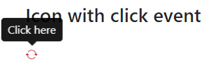
<Tooltip Title="Click here" @onclick="OnClick" role="button">
    <i class="bi bi-arrow-repeat text-danger"></i>
</Tooltip>
@code {
    private void OnClick()
    {
        Console.WriteLine($"clicked");
    }
}
See icon with tooltip demo here.
Dynamically update the tooltip text
<div class="mb-3">
    <Tooltip Title="@text" Placement="TooltipPlacement.Top">Tooltip Bottom</Tooltip>
</div>
<Button Type="ButtonType.Button" Color="ButtonColor.Primary" @onclick="ChangeTooltip">Change Tooltip</Button>

@code {
    private string text = "Tooltip text";

    private void ChangeTooltip() => text = $"Updated {DateTime.Now.ToLongTimeString()}";
}
Tooltip with HTML

<Tooltip Class="me-4" Title="<strong>Tooltip</strong> <em>with</em> <u>HTML</u>" IsHtml="true">Tooltip with HTML</Tooltip>