Blazor Icons
Blazor Bootstrap icon component will display an icon from any icon font.
Prerequisites
Install Bootstrap Icons or other.
- Refer: Bootstrap Icons
Include the icon fonts stylesheet in your website
<head>or@importin CSS from CDN.
<link href="https://cdn.jsdelivr.net/npm/bootstrap-icons@1.11.0/font/bootstrap-icons.css" rel="stylesheet" />
Parameters
| Name | Type | Default | Required | Description | Added Version |
|---|---|---|---|---|---|
| Color | IconColor | IconColor.None | Gets or sets the icon color. | 1.9.0 | |
| CustomIconName | string? | null | Specify custom icons of your own, like fontawesome. Example: fas fa-alarm-clock | 1.0.0 | |
| Name | IconName | IconName.None | Gets or sets the icon name. | 1.0.0 | |
| Size | IconSize | IconSize.None | Gets or sets the icon size. | 1.0.0 |
Either Name or CustomIconName parameter is mandatory. For Font Awesome setup, please follow the Font Awesome website.
Examples
Icons

<Icon Name="IconName.Alarm" />
<Icon Name="IconName.AlarmFill" />
<Icon Name="IconName.Window" />
<Icon Name="IconName.Apple" />
Sizes
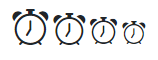
<Icon Name="IconName.Alarm" Size="IconSize.x2" />
<Icon Name="IconName.Alarm" Size="IconSize.x3" />
<Icon Name="IconName.Alarm" Size="IconSize.x4" />
<Icon Name="IconName.Alarm" Size="IconSize.x5" />
See icons with different size demo here.
Font awesome icons
In the following example, we used Font Awesome 6.4.2 free version icons. For Font Awesome setup, please follow the Font Awesome website.

<Icon CustomIconName="fa-solid fa-hands-clapping" Size="IconSize.x1" />
<Icon CustomIconName="fa-solid fa-hands-clapping" Size="IconSize.x2" />
<Icon CustomIconName="fa-solid fa-hands-clapping" Size="IconSize.x3" />
<Icon CustomIconName="fa-solid fa-hands-clapping" Size="IconSize.x4" />
<Icon CustomIconName="fa-solid fa-hands-clapping" Size="IconSize.x5" />
<Icon CustomIconName="fa-solid fa-hands-clapping" Size="IconSize.x6" />
Colors

<Icon Name="IconName.Facebook" Size="IconSize.x2" Color="IconColor.Primary" />
<Icon Name="IconName.CloudLightningRainFill" Size="IconSize.x2" Color="IconColor.Secondary" />
<Icon Name="IconName.CheckAll" Size="IconSize.x2" Color="IconColor.Success" />
<Icon Name="IconName.Bug" Size="IconSize.x2" Color="IconColor.Danger" />
<Icon Name="IconName.ExclamationDiamondFill" Size="IconSize.x2" Color="IconColor.Warning" />
<Icon Name="IconName.InfoCircleFill" Size="IconSize.x2" Color="IconColor.Info" />
<Icon Name="IconName.CreditCard2FrontFill" Size="IconSize.x2" Color="IconColor.Light" />
<Icon Name="IconName.Apple" Size="IconSize.x2" Color="IconColor.Dark" />
<Icon Name="IconName.Asterisk" Size="IconSize.x2" Color="IconColor.Body" />
<Icon Name="IconName.VolumeMuteFill" Size="IconSize.x2" Color="IconColor.Muted" />
<Icon Name="IconName.BrowserSafari" Size="IconSize.x2" Color="IconColor.White" />
See icons with different size demo here.
Inline text with icon

Inline text <Icon Name="IconName.Alarm" />
See inline text with icon demo here.
Link with icon

<a href="#" class="text-decoration-none">
    Example link text <Icon Name="IconName.Alarm" />
</a>
Link with custom icon

<a href="#" class="text-decoration-none">
    Example link text <Icon CustomIconName="bi bi-bootstrap" />
</a>
See link with custom icon demo here.
Button with icon and text

<Button Color="ButtonColor.Primary"><Icon Name="IconName.Alarm" /> Button </Button>
<Button Color="ButtonColor.Success"><Icon Name="IconName.Alarm" /> Button </Button>
<Button Color="ButtonColor.Danger" Outline="true"><Icon Name="IconName.AlarmFill" /> Button </Button>
See button with icon and text demo here.
Button with icon only

<Button Color="ButtonColor.Secondary"><Icon Name="IconName.Alarm" /></Button>
See button with icon only demo here.
Button with font awesome icon
In the following example, we used Font Awesome 6.4.2 free version icons. For Font Awesome setup, please follow the Font Awesome website.

<Button Color="ButtonColor.Secondary" TooltipTitle="Compare code">
    <Icon CustomIconName="fa-solid fa-code-compare"/>
</Button>
<Button Color="ButtonColor.Secondary" TooltipTitle="Create pull request">
    <Icon CustomIconName="fa-solid fa-code-pull-request" />
</Button>
Icon with tooltip
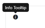
<Tooltip Title="Info Tooltip" role="button">
    <Icon Name="IconName.InfoCircleFill"></Icon>
</Tooltip>
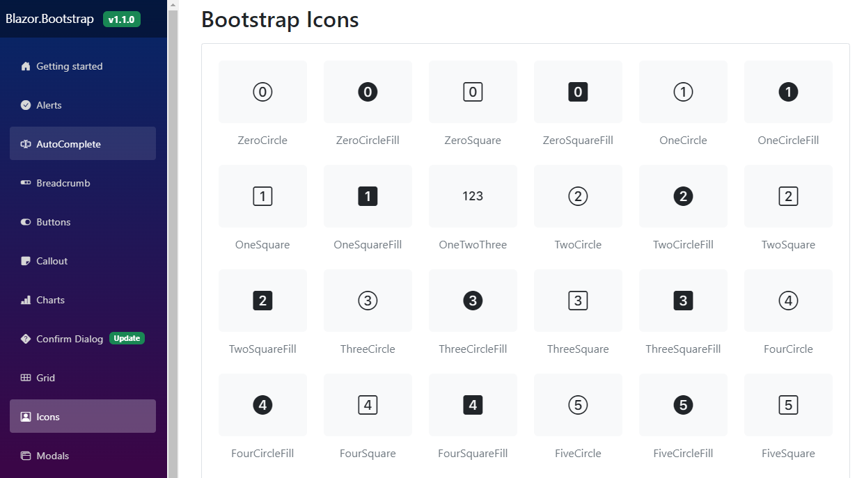
Bootstrap Icons