Blazor Buttons
Use Blazor Bootstrap button styles for actions in forms, dialogs, and more with support for multiple sizes, states, etc.
Parameters
| Name | Type | Default | Required | Description | Added Version |
|---|---|---|---|---|---|
| Active | bool | false | Gets or sets the button active state. | 1.0.0 | |
| Block | bool | false | Gets or sets the block level button. | 1.0.0 | |
| ChildContent | RenderFragment | null | ✔️ | Gets or sets the content to be rendered within the component. | 1.0.0 |
| Color | ButtonColor | ButtonColor.None | Gets or sets the button color. | 1.0.0 | |
| Disabled | bool | false | Gets or sets the button disabled state. | 1.0.0 | |
| Loading | bool | false | If true, shows the loading spinner or a LoadingTemplate. | 1.0.0 | |
| LoadingTemplate | RenderFragment | null | Gets or sets the button loading template. | 1.0.0 | |
| LoadingText | string | Loading... | Gets or sets the loading text. LoadingTemplate takes precedence. | 1.0.0 | |
| Outline | bool | false | Gets or sets the button outline. | 1.0.0 | |
| Position | Position | Position.None | Gets or sets the position. | 1.7.0 | |
| Size | Size | ButtonSize.None | Gets or sets the button size. | 1.0.0 | |
| TabIndex | int? | null | Gets or sets the button tab index. | 1.0.0 | |
| Target | Target | Target.None | Gets or sets the link button target. | 1.0.0 | |
| To | string? | null | Gets or sets the link button href attribute. | 1.0.0 | |
| TooltipColor | TooltipColor | TooltipColor.None | Gets or sets the button tooltip color. | 1.10.0 | |
| TooltipPlacement | TooltipPlacement | TooltipPlacement.Top | Gets or sets the button tooltip placement. | 1.0.0 | |
| TooltipTitle | string | null | Gets or sets the button tooltip title. | 1.0.0 | |
| Type | ButtonType | ButtonType.Button | Gets or sets the button type. | 1.0.0 |
Methods
| Name | Description | Added Version |
|---|---|---|
| HideLoading | Hides the loading state and enables the button. | 1.0.0 |
| ShowLoading | Shows the loading state and disables the button. | 1.0.0 |
Examples
Buttons
Blazor Bootstrap includes several predefined button styles, each serving its own semantic purpose, with a few extras thrown in for more control.

<p>
    <Button Color="ButtonColor.Primary"> Primary </Button>
    <Button Color="ButtonColor.Secondary"> Secondary </Button>
    <Button Color="ButtonColor.Success"> Success </Button>
    <Button Color="ButtonColor.Danger"> Danger </Button>
    <Button Color="ButtonColor.Warning"> Warning </Button>
    <Button Color="ButtonColor.Info"> Info </Button>
    <Button Color="ButtonColor.Light"> Light </Button>
    <Button Color="ButtonColor.Dark"> Dark </Button>
    <Button Color="ButtonColor.Link"> Link </Button>
</p>
Button tags
<p>
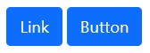
<Button Type="ButtonType.Link" Color="ButtonColor.Primary" To="#"> Link </Button>
<Button Type="ButtonType.Submit" Color="ButtonColor.Primary" To="#"> Button </Button>
</p>
Outline Buttons

<p>
    <Button Color="ButtonColor.Primary" Outline="true"> Primary </Button>
    <Button Color="ButtonColor.Secondary" Outline="true"> Secondary </Button>
    <Button Color="ButtonColor.Success" Outline="true"> Success </Button>
    <Button Color="ButtonColor.Danger" Outline="true"> Danger </Button>
    <Button Color="ButtonColor.Warning" Outline="true"> Warning </Button>
    <Button Color="ButtonColor.Info" Outline="true"> Info </Button>
    <Button Color="ButtonColor.Dark" Outline="true"> Dark </Button>
</p>
Some of the button styles use a relatively light foreground color, and should only be used on a dark background in order to have sufficient contrast.
Sizes
Fancy larger or smaller buttons? Add Size="Size.Large" or Size="Size.Small" for additional sizes.

<p>
    <Button Color="ButtonColor.Primary" Size="Size.Large"> Large button </Button>
    <Button Color="ButtonColor.Secondary" Size="Size.Large"> Large button </Button>
</p>
<p>
    <Button Color="ButtonColor.Primary" Size="Size.Small"> Small button </Button>
    <Button Color="ButtonColor.Secondary" Size="Size.Small"> Small button </Button>
</p>
See buttons with different size demo here.
Disabled State
Make buttons look inactive by adding the Disabled="true" boolean parameter to any <Button> component. Disabled buttons have pointer-events: none applied to, preventing hover and active states from triggering.
Disabled buttons using the Type="ButtonType.Link" parameter behave a bit different.

<p>
    <Button Color="ButtonColor.Primary" Size="Size.Large" Disabled="true"> Large button </Button>
    <Button Color="ButtonColor.Secondary" Size="Size.Large" Disabled="true"> Large button </Button>
</p>
<p>
    <Button Type="ButtonType.Link" Color="ButtonColor.Primary" Size="Size.Large" Disabled="true"> Primary link </Button>
    <Button Type="ButtonType.Link" Color="ButtonColor.Secondary" Size="Size.Large" Disabled="true"> Link </Button>
</p>
See button disabled state demo here.
Disable and enable state dynamically

<Button Type="ButtonType.Link" Color="ButtonColor.Primary" Disabled="@disableButton" TooltipTitle="@tooltip">Link Button</Button>
<Button Type="ButtonType.Submit" Color="ButtonColor.Primary" Disabled="@disableButton" TooltipTitle="@tooltip">Submit Button</Button>
<Button Type="ButtonType.Button" Color="ButtonColor.Primary" Disabled="@disableButton" TooltipTitle="@tooltip">Button</Button>
<Button Type="ButtonType.Reset" Color="ButtonColor.Primary" Disabled="@disableButton" TooltipTitle="@tooltip">Reset Button</Button>

<Button Color="ButtonColor.Danger" @onclick="() => SwapDisable()">Swap Disable</Button>
@code
{
    bool disableButton = true;
    string tooltip = "";

    public void SwapDisable()
    {
        disableButton = !disableButton;
        tooltip = $"Updated at {DateTime.Now}";
    }
}
See disable and enable state dynamically demo here.
Block Buttons
Create responsive stacks of full-width, "block buttons" like those in Bootstrap 4 with a mix of our display and gap utilities. By using utilities instead of button specific classes, we have much greater control over spacing, alignment, and responsive behaviors.

<div class="d-grid gap-2">
    <Button Color="ButtonColor.Primary"> Button </Button>
    <Button Color="ButtonColor.Primary"> Button </Button>
</div>

<div class="d-grid gap-2 d-md-block mt-2">
    <Button Color="ButtonColor.Primary"> Button </Button>
    <Button Color="ButtonColor.Primary"> Button </Button>
</div>

<div class="d-grid gap-2 col-6 mx-auto mt-2">
    <Button Color="ButtonColor.Primary"> Button </Button>
    <Button Color="ButtonColor.Primary"> Button </Button>
</div>

<div class="d-grid gap-2 d-md-flex justify-content-md-end mt-2">
    <Button Color="ButtonColor.Primary"> Button </Button>
    <Button Color="ButtonColor.Primary"> Button </Button>
</div>
Toggle States
If you''re pre-toggling a button, you must manually add the Active="true" parameter.

<p>
    <Button Color="ButtonColor.Primary"> Toggle button </Button>
    <Button Color="ButtonColor.Primary" Active="true"> Active toggle button </Button>
    <Button Color="ButtonColor.Primary" Disabled="true"> Disabled toggle button </Button>
</p>
See button toggle states demo here.
Loading spinner
Use spinners within buttons to indicate an action is currently processing or taking place. You may also swap the text out of the spinner element and utilize button text as needed.

<p>
    <Button Color="ButtonColor.Primary" Loading="true" />
    <Button Color="ButtonColor.Primary" Loading="true" LoadingText="Saving..." />
    <Button Color="ButtonColor.Primary" Loading="true">
        <LoadingTemplate>
            <span class="spinner-grow spinner-grow-sm" role="status" aria-hidden="true"></span>
            Loading...
        </LoadingTemplate>
    </Button>
</p>
See button with loading spinner demo here.
Show/Hide loading spinner
Use ShowLoading() and HideLoading() methods to toggle the button state.

<Button @ref="saveButton" Color="ButtonColor.Primary" @onclick="async () => await OnSaveClick()">Save</Button>
@code {
    private Button saveButton;

    private async Task OnSaveClick()
    {
        saveButton?.ShowLoading("Saving details...");

        await Task.Delay(5000); // API call

        saveButton?.HideLoading();
    }
}
See button with loading spinner demo here.
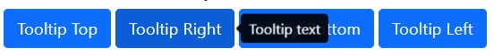
Show Tooltip
Hover over the buttons below to see the four tooltips directions: top, right, bottom, and left.
<p>
    <Button Color="ButtonColor.Primary" TooltipTitle="Tooltip text" TooltipPlacement="TooltipPlacement.Top"> Tooltip Top </Button>

    <Button Color="ButtonColor.Primary" TooltipTitle="Tooltip text" TooltipPlacement="TooltipPlacement.Right"> Tooltip Right </Button>

    <Button Color="ButtonColor.Primary" TooltipTitle="Tooltip text" TooltipPlacement="TooltipPlacement.Bottom"> Tooltip Bottom </Button>

    <Button Color="ButtonColor.Primary" TooltipTitle="Tooltip text" TooltipPlacement="TooltipPlacement.Left"> Tooltip Left </Button>
</p>
See button with tooltip demo here.
HTML tooltips not supported at this moment.
Dynamically update the tooltip text
<div class="mb-3">
    <Button Color="ButtonColor.Primary" TooltipTitle="@text" TooltipPlacement="TooltipPlacement.Top"> Tooltip Top </Button>
</div>

<Button Type="ButtonType.Button" Color="ButtonColor.Primary" @onclick="ChangeTooltip">Change Tooltip</Button>
@code {
    private string text = "Tooltip text";

    private void ChangeTooltip() => text = $"Updated {DateTime.Now.ToLongTimeString()}";
}
Events
Click events
<p>
    <Button Color="ButtonColor.Primary" @onclick="OnClick"> Click Event </Button>
</p>
@code{

    protected void OnClick(EventArgs args)
    {
        Console.WriteLine("click event");
    }

}
Double click event
<p>
    <Button Color="ButtonColor.Primary" @ondblclick="OnDoubleClick"> Double Click Event </Button>
</p>
@code{

    protected void OnDoubleClick(EventArgs args)
    {
        Console.WriteLine("double click event");
    }

}
Click event with arguments
<p>
    <Button Color="ButtonColor.Primary" @onclick="((args) => OnClickWithArgs(args, message))"> Click   Args </Button>
</p>
@code{

    public string message = "Test message";

    protected void OnClickWithArgs(EventArgs args, string message)
    {
        Console.WriteLine($"message: {message}");
    }

}