Blazor Collapse
Toggle the visibility of content across your project with the Blazor Bootstrap Collapse component.
Parameters
| Name | Type | Default | Required | Description | Added Version |
|---|---|---|---|---|---|
| ChildContent | RenderFragment | null | ✔️ | Gets or sets the content to be rendered within the component. | 1.7.0 |
| Horizontal | bool | false | Gets or sets the horizontal collapsing. | 1.7.0 | |
| Parent | string | null | Gets or sets the parent. | 1.7.0 | |
| Toggle | bool | false | Toggles the collapsible element on invocation. | 1.7.0 |
Methods
| Name | Description | Added Version |
|---|---|---|
| ShowAsync | Shows a collapsible element. | 1.7.0 |
| HideAsync | Hides a collapsible element. | 1.7.0 |
| ToggleAsync | Toggles a collapsible element to shown or hidden. | 1.7.0 |
Events
| Name | Description | Added Version |
|---|---|---|
| OnShowing | This event fires immediately when the show instance method is called. | 1.7.0 |
| OnShown | This event is fired when a collapse element has been made visible to the user (will wait for CSS transitions to complete). | 1.7.0 |
| OnHiding | This event is fired immediately when the hide method has been called. | 1.7.0 |
| OnHidden | This event is fired when a collapse element has been hidden from the user (will wait for CSS transitions to complete). | 1.7.0 |
How it works
The Collapse component is used to show and hide content. Use ShowAsync, HideAsync, and ToggleAsync methods to toggle the content.
Collapsing an element will animate the height from its current value to 0.
info
The animation effect of this component is dependent on the prefers-reduced-motion media query. See the reduced motion section of our accessibility documentation.
Examples
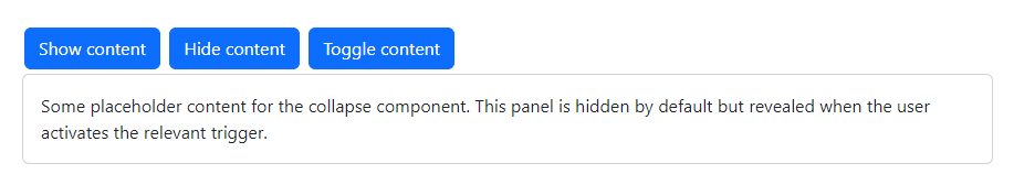
Click the buttons below to show and hide the content.
<Button Type="ButtonType.Button" Color="ButtonColor.Primary" @onclick="ShowContentAsync">Show content</Button>
<Button Type="ButtonType.Button" Color="ButtonColor.Primary" @onclick="HideContentAsync">Hide content</Button>
<Button Type="ButtonType.Button" Color="ButtonColor.Primary" @onclick="ToggleContentAsync">Toggle content</Button>

<Collapse @ref="collapse1">
    <Card>
        <CardBody>
            Some placeholder content for the collapse component. This panel is hidden by default but revealed when the user activates the relevant trigger.
        </CardBody>
    </Card>
</Collapse>
@code {
    Collapse collapse1 = default!;

    private async Task ShowContentAsync() => await collapse1.ShowAsync();
    private async Task HideContentAsync() => await collapse1.HideAsync();
    private async Task ToggleContentAsync() => await collapse1.ToggleAsync();
}
Horizontal
The Collapse component supports horizontal collapsing.
Set the Horizontal parameter to true to enable horizontal collapsing.

<Button Type="ButtonType.Button" Color="ButtonColor.Primary" @onclick="ShowContentAsync">Show content</Button>
<Button Type="ButtonType.Button" Color="ButtonColor.Primary" @onclick="HideContentAsync">Hide content</Button>
<Button Type="ButtonType.Button" Color="ButtonColor.Primary" @onclick="ToggleContentAsync">Toggle content</Button>

<Collapse @ref="collapse1" Horizontal="true">
    <Card Style="width:300px;">
        <CardBody>
            This is some placeholder content for a horizontal collapse. It's hidden by default and shown when triggered.
        </CardBody>
    </Card>
</Collapse>
@code {
    Collapse collapse1 = default!;

    private async Task ShowContentAsync() => await collapse1.ShowAsync();
    private async Task HideContentAsync() => await collapse1.HideAsync();
    private async Task ToggleContentAsync() => await collapse1.ToggleAsync();
}
Events Example
Blazor Bootstrap Collapse component exposes a few events for hooking into collapse functionality.
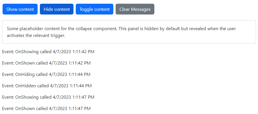
<Button Type="ButtonType.Button" Color="ButtonColor.Primary" @onclick="ShowContentAsync">Show content</Button>
<Button Type="ButtonType.Button" Color="ButtonColor.Primary" @onclick="HideContentAsync">Hide content</Button>
<Button Type="ButtonType.Button" Color="ButtonColor.Primary" @onclick="ToggleContentAsync">Toggle content</Button>
<Button Type="ButtonType.Button" Color="ButtonColor.Secondary" @onclick="ClearMessage">Clear Messages</Button>

<Collapse @ref="collapse1"
          Class="mt-3"
          OnShowing="OnCollapseShowingAsync"
          OnShown="OnCollapseShownAsync"
          OnHiding="OnCollapseHidingAsync"
          OnHidden="OnCollapseHiddenAsync">
    <Card>
        <CardBody>
            Some placeholder content for the collapse component. This panel is hidden by default but revealed when the user activates the relevant trigger.
        </CardBody>
    </Card>
</Collapse>

<div class="mt-3">
    @foreach (var item in messages)
    {
        <p>@item</p>
    }
</div>
@code {
    Collapse collapse1 = default!;

    List<string> messages = new List<string>();

    private async Task ShowContentAsync() => await collapse1.ShowAsync();
    private async Task HideContentAsync() => await collapse1.HideAsync();
    private async Task ToggleContentAsync() => await collapse1.ToggleAsync();

    private void OnCollapseShowingAsync() => messages.Add($"Event: OnShowing called {DateTime.Now.ToLocalTime()}");

    private void OnCollapseShownAsync() => messages.Add($"Event: OnShown called {DateTime.Now.ToLocalTime()}");

    private void OnCollapseHidingAsync() => messages.Add($"Event: OnHiding called {DateTime.Now.ToLocalTime()}");

    private void OnCollapseHiddenAsync() => messages.Add($"Event: OnHidden called {DateTime.Now.ToLocalTime()}");

    private void ClearMessage() => messages = new List<string>();
}