Blazor Card
BootstrapBootstrap's cards provide a flexible and extensible content container with multiple variants and options.

About
A card is a flexible and extensible content container. It includes options for headers and footers, a wide variety of content, contextual background colors, and powerful display options.
Parameters
Card Parameters
| Name | Type | Default | Required | Description | Added Version |
|---|---|---|---|---|---|
| ChildContent | RenderFragment | null | ✔️ | Gets or sets the content to be rendered within the component. | 1.10.0 |
| Color | CardColor | CardColor.None | Gets or sets the card color. | 1.10.0 | |
| TextAlignment | Alignment | Alignment.None | Gets or sets the text alignment of the card. | 1.10.0 |
CardBody Parameters
| Name | Type | Default | Required | Description | Added Version |
|---|---|---|---|---|---|
| ChildContent | RenderFragment | null | ✔️ | Gets or sets the content to be rendered within the component. | 1.10.0 |
CardFooter Parameters
| Name | Type | Default | Required | Description | Added Version |
|---|---|---|---|---|---|
| ChildContent | RenderFragment | null | ✔️ | Gets or sets the content to be rendered within the component. | 1.10.0 |
CardGroup Parameters
| Name | Type | Default | Required | Description | Added Version |
|---|---|---|---|---|---|
| ChildContent | RenderFragment | null | ✔️ | Gets or sets the content to be rendered within the component. | 1.10.0 |
CardHeader Parameters
| Name | Type | Default | Required | Description | Added Version |
|---|---|---|---|---|---|
| ChildContent | RenderFragment | null | ✔️ | Gets or sets the content to be rendered within the component. | 1.10.0 |
| Color | CardColor | CardColor.None | Gets or sets the card header color. | 1.10.4 |
CardLink Parameters
| Name | Type | Default | Required | Description | Added Version |
|---|---|---|---|---|---|
| ChildContent | RenderFragment | null | ✔️ | Gets or sets the content to be rendered within the component. | 1.10.0 |
| Disabled | bool | false | If true, disables the card link. | 1.10.0 | |
| TabIndex | int? | null | Gets or sets the card link tab index. | 1.10.0 | |
| Target | Target | Target.None | Gets or sets the card link target. | 1.10.0 | |
| To | string? | null | Gets or sets the link href attribute. | 1.10.0 |
CardSubTitle Parameters
| Name | Type | Default | Required | Description | Added Version |
|---|---|---|---|---|---|
| ChildContent | RenderFragment | null | ✔️ | Gets or sets the content to be rendered within the component. | 1.10.0 |
| Size | HeadingSize | HeadingSize.H6 | Gets or sets the card sub title size. | 1.10.0 |
CardText Parameters
| Name | Type | Default | Required | Description | Added Version |
|---|---|---|---|---|---|
| ChildContent | RenderFragment | null | ✔️ | Gets or sets the content to be rendered within the component. | 1.10.0 |
CardTitle Parameters
| Name | Type | Default | Required | Description | Added Version |
|---|---|---|---|---|---|
| ChildContent | RenderFragment | null | ✔️ | Gets or sets the content to be rendered within the component. | 1.10.0 |
| Size | HeadingSize | HeadingSize.H5 | Gets or sets the card title size. | 1.10.0 |
Examples
Card
Below is an example of a basic card with mixed content and a fixed width. Cards have no fixed width to start, so they'll naturally fill the full width of its parent element.
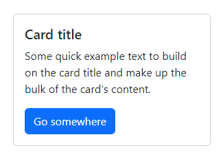
<Card Style="width:18rem;">
    <CardBody>
        <CardTitle>Card title</CardTitle>
        <CardText>Some quick example text to build on the card title and make up the bulk of the card's content.</CardText>
        <Button Color="ButtonColor.Primary" To="#" Type="ButtonType.Link">Go somewhere</Button>
    </CardBody>
</Card>
Content types
Cards support a wide variety of content, including images, text, list groups, links, and more. Below are examples of what’s supported.
Body
The building block of a card is the CardBody. Use it whenever you need a padded section within a card.
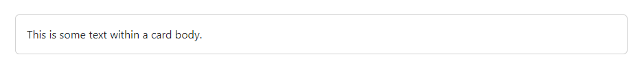
<Card>
    <CardBody>
        This is some text within a card body.
    </CardBody>
</Card>
Titles, text, and links
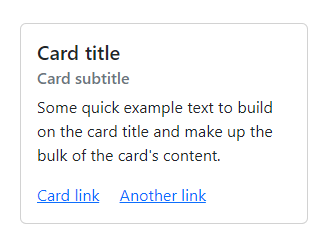
<Card Style="width:18rem;">
    <CardBody>
        <CardTitle>Card title</CardTitle>
        <CardSubTitle Class="mb-2 text-muted">Card subtitle</CardSubTitle>
        <CardText>Some quick example text to build on the card title and make up the bulk of the card's content.</CardText>
        <CardLink To="#">Card link</CardLink>
        <CardLink To="#">Another link</CardLink>
    </CardBody>
</Card>
Images
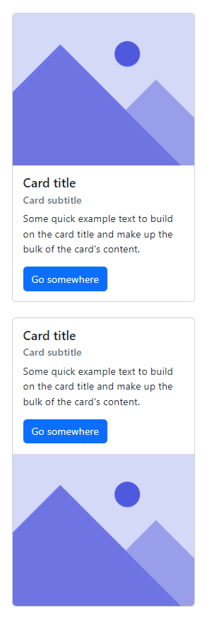
<Card Class="mb-4" Style="width:18rem;">
    <img class="rounded-top" src="/images/placeholder.png" alt="placeholder" />
    <CardBody>
        <CardTitle>Card title</CardTitle>
        <CardSubTitle Class="mb-2 text-muted">Card subtitle</CardSubTitle>
        <CardText>Some quick example text to build on the card title and make up the bulk of the card's content.</CardText>
        <Button Color="ButtonColor.Primary" To="#" Type="ButtonType.Link">Go somewhere</Button>
    </CardBody>
</Card>

<Card Style="width:18rem;">
    <CardBody>
        <CardTitle>Card title</CardTitle>
        <CardSubTitle Class="mb-2 text-muted">Card subtitle</CardSubTitle>
        <CardText>Some quick example text to build on the card title and make up the bulk of the card's content.</CardText>
        <Button Color="ButtonColor.Primary" To="#" Type="ButtonType.Link">Go somewhere</Button>
    </CardBody>
    <img class="rounded-bottom" src="/images/placeholder.png" alt="placeholder" />
</Card>
List groups
Create lists of content in a card with a flush list group.
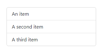
<Card Style="width:18rem;">
    <ul class="list-group list-group-flush">
        <li class="list-group-item">An item</li>
        <li class="list-group-item">A second item</li>
        <li class="list-group-item">A third item</li>
    </ul>
</Card>
Kitchen sink
Mix and match multiple content types to create the card you need, or throw everything in there. Shown below are image styles, blocks, text styles, and a list group—all wrapped in a fixed-width card.
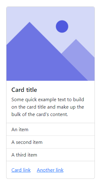
<Card Style="width:18rem;">
    <img class="rounded-top" src="/images/placeholder.png" alt="placeholder" />
    <CardBody>
        <CardTitle>Card title</CardTitle>
        <CardText>Some quick example text to build on the card title and make up the bulk of the card's content.</CardText>
    </CardBody>
    <ul class="list-group list-group-flush">
        <li class="list-group-item">An item</li>
        <li class="list-group-item">A second item</li>
        <li class="list-group-item">A third item</li>
    </ul>
    <CardBody>
        <CardLink To="#">Card link</CardLink>
        <CardLink To="#">Another link</CardLink>
    </CardBody>
</Card>
Header and footer
Add an optional header and/or footer within a card.
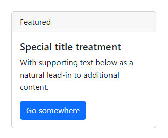
<Card Style="width:18rem;">
    <CardHeader>
        Featured
    </CardHeader>
    <CardBody>
        <CardTitle>Special title treatment</CardTitle>
        <CardText>With supporting text below as a natural lead-in to additional content.</CardText>
        <Button Color="ButtonColor.Primary" To="#" Type="ButtonType.Link">Go somewhere</Button>
    </CardBody>
</Card>
Sizing
Cards assume no specific width to start, so they’ll be 100% wide unless otherwise stated. You can change this as needed with custom CSS, grid classes, grid Sass mixins, or utilities.
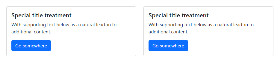
<div class="row">
    <div class="col-sm-6">
        <Card>
            <CardBody>
                <CardTitle>Special title treatment</CardTitle>
                <CardText>With supporting text below as a natural lead-in to additional content.</CardText>
                <Button Color="ButtonColor.Primary" To="#" Type="ButtonType.Link">Go somewhere</Button>
            </CardBody>
        </Card>
    </div>
</div>
Text alignment
You can quickly change the text alignment of any card—in its entirety or specific parts—with our TextAlignment parameter.
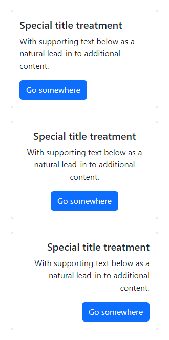
<Card Class="mb-4" Style="width:18rem;">
    <CardBody>
        <CardTitle>Special title treatment</CardTitle>
        <CardText>With supporting text below as a natural lead-in to additional content.</CardText>
        <Button Color="ButtonColor.Primary" To="#" Type="ButtonType.Link">Go somewhere</Button>
    </CardBody>
</Card>

<Card TextAlignment="Alignment.Center" Class="mb-4" Style="width:18rem;">
    <CardBody>
        <CardTitle>Special title treatment</CardTitle>
        <CardText>With supporting text below as a natural lead-in to additional content.</CardText>
        <Button Color="ButtonColor.Primary" To="#" Type="ButtonType.Link">Go somewhere</Button>
    </CardBody>
</Card>

<Card TextAlignment="Alignment.End" Class="mb-4" Style="width:18rem;">
    <CardBody>
        <CardTitle>Special title treatment</CardTitle>
        <CardText>With supporting text below as a natural lead-in to additional content.</CardText>
        <Button Color="ButtonColor.Primary" To="#" Type="ButtonType.Link">Go somewhere</Button>
    </CardBody>
</Card>
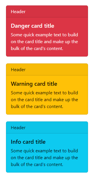
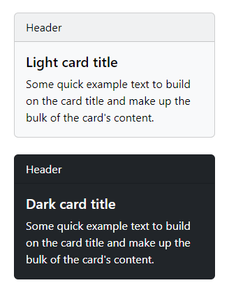
Background and color
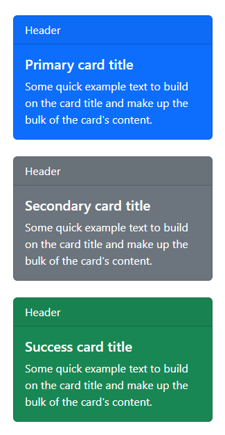
<Card Color="CardColor.Primary" Class="mb-4" Style="width:18rem;">
    <CardHeader>Header</CardHeader>
    <CardBody>
        <CardTitle>Primary card title</CardTitle>
        <CardText>Some quick example text to build on the card title and make up the bulk of the card's content.</CardText>
    </CardBody>
</Card>

<Card Color="CardColor.Secondary" Class="mb-4" Style="width:18rem;">
    <CardHeader>Header</CardHeader>
    <CardBody>
        <CardTitle>Secondary card title</CardTitle>
        <CardText>Some quick example text to build on the card title and make up the bulk of the card's content.</CardText>
    </CardBody>
</Card>

<Card Color="CardColor.Success" Class="mb-4" Style="width:18rem;">
    <CardHeader>Header</CardHeader>
    <CardBody>
        <CardTitle>Success card title</CardTitle>
        <CardText>Some quick example text to build on the card title and make up the bulk of the card's content.</CardText>
    </CardBody>
</Card>

<Card Color="CardColor.Danger" Class="mb-4" Style="width:18rem;">
    <CardHeader>Header</CardHeader>
    <CardBody>
        <CardTitle>Danger card title</CardTitle>
        <CardText>Some quick example text to build on the card title and make up the bulk of the card's content.</CardText>
    </CardBody>
</Card>

<Card Color="CardColor.Warning" Class="mb-4" Style="width:18rem;">
    <CardHeader>Header</CardHeader>
    <CardBody>
        <CardTitle>Warning card title</CardTitle>
        <CardText>Some quick example text to build on the card title and make up the bulk of the card's content.</CardText>
    </CardBody>
</Card>

<Card Color="CardColor.Info" Class="mb-4" Style="width:18rem;">
    <CardHeader>Header</CardHeader>
    <CardBody>
        <CardTitle>Info card title</CardTitle>
        <CardText>Some quick example text to build on the card title and make up the bulk of the card's content.</CardText>
    </CardBody>
</Card>

<Card Color="CardColor.Light" Class="mb-4" Style="width:18rem;">
    <CardHeader>Header</CardHeader>
    <CardBody>
        <CardTitle>Light card title</CardTitle>
        <CardText>Some quick example text to build on the card title and make up the bulk of the card's content.</CardText>
    </CardBody>
</Card>

<Card Color="CardColor.Dark" Class="mb-4" Style="width:18rem;">
    <CardHeader>Header</CardHeader>
    <CardBody>
        <CardTitle>Dark card title</CardTitle>
        <CardText>Some quick example text to build on the card title and make up the bulk of the card's content.</CardText>
    </CardBody>
</Card>
Card groups
Use card groups to render cards as a single, attached element with equal width and height columns. Card groups start off stacked and use display: flex; to become attached with uniform dimensions starting at the sm breakpoint.
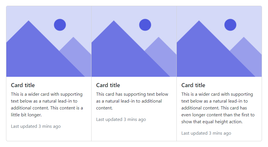
<CardGroup>
    <Card Class="mb-4" Style="width:18rem;">
        <img src="/images/placeholder.png" alt="placeholder" />
        <CardBody>
            <CardTitle>Card title</CardTitle>
            <CardText>This is a wider card with supporting text below as a natural lead-in to additional content. This content is a little bit longer.</CardText>
            <CardText Class="text-muted">Last updated 3 mins ago</CardText>
        </CardBody>
    </Card>
    <Card Class="mb-4" Style="width:18rem;">
        <img src="/images/placeholder.png" alt="placeholder" />
        <CardBody>
            <CardTitle>Card title</CardTitle>
            <CardText>This card has supporting text below as a natural lead-in to additional content.</CardText>
            <CardText Class="text-muted">Last updated 3 mins ago</CardText>
        </CardBody>
    </Card>
    <Card Class="mb-4" Style="width:18rem;">
        <img src="/images/placeholder.png" alt="placeholder" />
        <CardBody>
            <CardTitle>Card title</CardTitle>
            <CardText>This is a wider card with supporting text below as a natural lead-in to additional content. This card has even longer content than the first to show that equal height action.</CardText>
            <CardText Class="text-muted">Last updated 3 mins ago</CardText>
        </CardBody>
    </Card>
</CardGroup>
Card groups with footer
When using card groups with footers, their content will automatically line up.
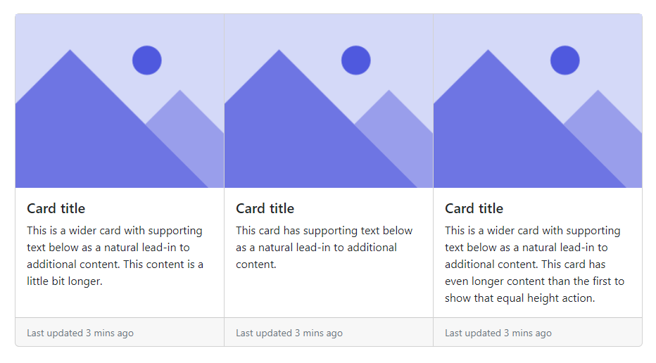
<CardGroup>
    <Card Class="mb-4" Style="width:18rem;">
        <img src="/images/placeholder.png" alt="placeholder" />
        <CardBody>
            <CardTitle>Card title</CardTitle>
            <CardText>This is a wider card with supporting text below as a natural lead-in to additional content. This content is a little bit longer.</CardText>
        </CardBody>
        <CardFooter>
            <small class="text-muted">Last updated 3 mins ago</small>
        </CardFooter>
    </Card>
    <Card Class="mb-4" Style="width:18rem;">
        <img src="/images/placeholder.png" alt="placeholder" />
        <CardBody>
            <CardTitle>Card title</CardTitle>
            <CardText>This card has supporting text below as a natural lead-in to additional content.</CardText>
        </CardBody>
        <CardFooter>
            <small class="text-muted">Last updated 3 mins ago</small>
        </CardFooter>
    </Card>
    <Card Class="mb-4" Style="width:18rem;">
        <img src="/images/placeholder.png" alt="placeholder" />
        <CardBody>
            <CardTitle>Card title</CardTitle>
            <CardText>This is a wider card with supporting text below as a natural lead-in to additional content. This card has even longer content than the first to show that equal height action.</CardText>
        </CardBody>
        <CardFooter>
            <small class="text-muted">Last updated 3 mins ago</small>
        </CardFooter>
    </Card>
</CardGroup>