Blazor Progress
Documentation and examples for using the Blazor Bootstrap progress component featuring support for stacked bars, animated backgrounds, and text labels.
Progress Parameters
| Name | Type | Default | Required | Description | Added Version |
|---|---|---|---|---|---|
| ChildContent | RenderFragment | null | ✔️ | Gets or sets the content to be rendered within the component. | 1.0.0 |
| Height | double | 16 | Gets or sets the height of the Progress. Height is measured in pixels, and the default height is 16 pixels. | 1.0.0 |
ProgressBar Parameters
| Name | Type | Default | Required | Description | Added Version |
|---|---|---|---|---|---|
| Color | ProgressColor | ProgressColor.None | Gets or sets the progress color. | 1.0.0 | |
| Label | string | null | Gets or sets the progress bar label. | 1.0.0 | |
| Type | ProgressType | ProgressType.Default | Gets or sets the progress bar type. | 1.0.0 | |
| Width | double | 0 | Get or sets the progress bar width. | 1.0.0 |
ProgressBar Methods
| Name | Description |
|---|---|
| DecreaseWidth | Decrease the progress bar width. |
| GetWidth | Get the progress bar width. |
| IncreaseWidth | Increase the progress bar width. |
| SetColor | Set the progress bar color. |
| SetLabel | Set the progress bar label. |
| SetWidth | Set the progress bar width. |
Examples
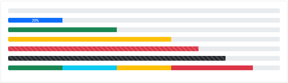
How it works
<Progress Class="mb-3">
    <ProgressBar />
</Progress>
<Progress Class="mb-3">
    <ProgressBar Width="20" Label="20%" />
</Progress>
<Progress Class="mb-3">
    <ProgressBar Color="ProgressColor.Success" Width="40" />
</Progress>
<Progress Class="mb-3">
    <ProgressBar Color="ProgressColor.Warning" Width="60" />
</Progress>
<Progress Class="mb-3">
    <ProgressBar Type="ProgressType.Striped" Color="ProgressColor.Danger" Width="70" />
</Progress>
<Progress Class="mb-3">
    <ProgressBar Type="ProgressType.StripedAndAnimated" Color="ProgressColor.Dark" Width="80" />
</Progress>
<Progress Class="mb-3">
    <ProgressBar Color="ProgressColor.Success" Width="20" />
    <ProgressBar Color="ProgressColor.Info" Width="20" />
    <ProgressBar Color="ProgressColor.Warning" Width="20" />
    <ProgressBar Color="ProgressColor.Danger" Width="30" />
</Progress>
Labels
Add labels to your Blazor ProgressBar component using the Label parameter or by calling the SetLabel(...) method.

<Progress Class="mb-3">
    <ProgressBar Width="20" Label="20%" />
</Progress>
Set width programmatically
Use IncreaseWidth() or DecreaseProgressBar() methods to increase or decrease the Blazor ProgressBar width.

<Progress Class="mb-3">
    <ProgressBar @ref="progressBar" />
</Progress>

<div class="mb-3">
    <Button Type="ButtonType.Button" Color="ButtonColor.Primary" Size="Size.Small" @onclick="IncreaseProgressBar">Increase by 10%</Button>
    <Button Type="ButtonType.Button" Color="ButtonColor.Primary" Size="Size.Small" @onclick="DecreaseProgressBar">Decrease by 10%</Button>
    <Button Type="ButtonType.Button" Color="ButtonColor.Primary" Size="Size.Small" @onclick="ResetProgressBar">Reset</Button>
</div>
@code {
    ProgressBar progressBar;

    private void IncreaseProgressBar()
    {
        progressBar.IncreaseWidth(10);
        progressBar.SetLabel($"{progressBar.GetWidth()}%");
    }

    private void DecreaseProgressBar()
    {
        progressBar.DecreaseProgressBar(10);
        progressBar.SetLabel($"{progressBar.GetWidth()}%");
    }

    private void ResetProgressBar()
    {
        progressBar.SetWidth(0);
        progressBar.SetLabel($"{progressBar.GetWidth()}%");
    }
}
Height
Set the height of the Blazor Progress by using the Height parameter. Height is measured in pixels.

<Progress Class="mb-3" Height="1">
    <ProgressBar Width="20" />
</Progress>
<Progress Class="mb-3" Height="5">
    <ProgressBar Width="20" />
</Progress>
<Progress Class="mb-3">
    <ProgressBar Width="40" />
</Progress>
<Progress Class="mb-3" Height="20">
    <ProgressBar Width="40" />
</Progress>
Backgrounds
Use the Color parameter or the SetColor(ProgressColor color) method to change the appearance of individual Blazor ProgressBar components.

<Progress Class="mb-3">
    <ProgressBar Color="ProgressColor.Success" Width="10" />
</Progress>
<Progress Class="mb-3">
    <ProgressBar Color="ProgressColor.Info" Width="20" />
</Progress>
<Progress Class="mb-3">
    <ProgressBar Color="ProgressColor.Warning" Width="30" />
</Progress>
<Progress Class="mb-3">
    <ProgressBar Color="ProgressColor.Danger" Width="40" />
</Progress>
<Progress Class="mb-3">
    <ProgressBar Color="ProgressColor.Primary" Width="60" />
</Progress>
<Progress Class="mb-3">
    <ProgressBar Color="ProgressColor.Secondary" Width="70" />
</Progress>
<Progress Class="mb-3">
    <ProgressBar Color="ProgressColor.Dark" Width="80" />
</Progress>
Set background programmatically
You can dynamically set the Blazor ProgressBar color by calling the SetColor() method.

<Progress Class="mb-3">
    <ProgressBar @ref="progressBar" Width="30" Label="30%" />
</Progress>

<div>
    <Button Type="ButtonType.Button" Color="ButtonColor.Success" Size="Size.Small" @onclick="() => SetColor(ProgressColor.Success)">Set Color</Button>
    <Button Type="ButtonType.Button" Color="ButtonColor.Info" Size="Size.Small" @onclick="() => SetColor(ProgressColor.Info)">Set Color</Button>
    <Button Type="ButtonType.Button" Color="ButtonColor.Warning" Size="Size.Small" @onclick="() => SetColor(ProgressColor.Warning)">Set Color</Button>
    <Button Type="ButtonType.Button" Color="ButtonColor.Danger" Size="Size.Small" @onclick="() => SetColor(ProgressColor.Danger)">Set Color</Button>
    <Button Type="ButtonType.Button" Color="ButtonColor.Primary" Size="Size.Small" @onclick="() => SetColor(ProgressColor.Primary)">Set Color</Button>
    <Button Type="ButtonType.Button" Color="ButtonColor.Secondary" Size="Size.Small" @onclick="() => SetColor(ProgressColor.Secondary)">Set Color</Button>
    <Button Type="ButtonType.Button" Color="ButtonColor.Dark" Size="Size.Small" @onclick="() => SetColor(ProgressColor.Dark)">Set Color</Button>
</div>
@code {
    ProgressBar progressBar;
    private void SetColor(ProgressColor color) => progressBar.SetColor(color);
}
Multiple bars
Include multiple Blazor ProgressBar components in a Blazor Progress component if needed.

<Progress Class="mb-3">
    <ProgressBar Color="ProgressColor.Success" Width="20" />
    <ProgressBar Color="ProgressColor.Info" Width="20" />
    <ProgressBar Color="ProgressColor.Warning" Width="20" />
    <ProgressBar Color="ProgressColor.Danger" Width="10" />
</Progress>
Striped
Add Type="ProgressType.Striped" to any Blazor ProgressBar component to apply a stripe.

<Progress Class="mb-3">
    <ProgressBar Type="ProgressType.Striped" Color="ProgressColor.Success" Width="10" />
</Progress>
<Progress Class="mb-3">
    <ProgressBar Type="ProgressType.Striped" Color="ProgressColor.Info" Width="20" />
</Progress>
<Progress Class="mb-3">
    <ProgressBar Type="ProgressType.Striped" Color="ProgressColor.Warning" Width="30" />
</Progress>
<Progress Class="mb-3">
    <ProgressBar Type="ProgressType.Striped" Color="ProgressColor.Danger" Width="40" />
</Progress>
<Progress Class="mb-3">
    <ProgressBar Type="ProgressType.Striped" Color="ProgressColor.Primary" Width="60" />
</Progress>
<Progress Class="mb-3">
    <ProgressBar Type="ProgressType.Striped" Color="ProgressColor.Secondary" Width="80" />
</Progress>
<Progress Class="mb-3">
    <ProgressBar Type="ProgressType.Striped" Color="ProgressColor.Dark" Width="100" />
</Progress>
Animated stripes
The stripes can also be animated. Add Type="ProgressType.StripedAndAnimated" to the Blazor ProgressBar component to animate the stripes right to the left.

<Progress Class="mb-3">
    <ProgressBar Type="ProgressType.StripedAndAnimated" Color="ProgressColor.Success" Width="10" />
</Progress>
<Progress Class="mb-3">
    <ProgressBar Type="ProgressType.StripedAndAnimated" Color="ProgressColor.Info" Width="20" />
</Progress>
<Progress Class="mb-3">
    <ProgressBar Type="ProgressType.StripedAndAnimated" Color="ProgressColor.Warning" Width="30" />
</Progress>
<Progress Class="mb-3">
    <ProgressBar Type="ProgressType.StripedAndAnimated" Color="ProgressColor.Danger" Width="40" />
</Progress>
<Progress Class="mb-3">
    <ProgressBar Type="ProgressType.StripedAndAnimated" Color="ProgressColor.Primary" Width="60" />
</Progress>
<Progress Class="mb-3">
    <ProgressBar Type="ProgressType.StripedAndAnimated" Color="ProgressColor.Secondary" Width="80" />
</Progress>
<Progress Class="mb-3">
    <ProgressBar Type="ProgressType.StripedAndAnimated" Color="ProgressColor.Dark" Width="100" />
</Progress>