Blazor Ribbon
Documentation and examples for using the Blazor Bootstrap Ribbon component.

Ribbon Parameters
| Name | Type | Default | Required | Description | Added Version |
|---|---|---|---|---|---|
| ChildContent | RenderFragment | null | ✔️ | Gets or sets the content to be rendered within the component. | 2.2.0 |
| EnableFadeEffect | bool | false | Gets or sets the tabs fade effect. | 2.2.0 |
RibbonTab Parameters
| Name | Type | Default | Required | Description | Added Version |
|---|---|---|---|---|---|
| Active | bool | false | Gets or sets the active state. | 2.2.0 | |
| Content | RenderFragment | null | ✔️ | Gets or sets the content to be rendered within the component. | 2.2.0 |
| Disabled | bool | false | Gets or sets the disabled state. | 2.2.0 | |
| Name | string | null | Gets or sets the tab name. | 2.2.0 | |
| Title | string | null | Gets or sets the tab title. | 2.2.0 | |
| TitleTemplate | RenderFragment | null | Gets or sets the tab title template. | 2.2.0 |
RibbonGroup Parameters
| Name | Type | Default | Required | Description | Added Version |
|---|---|---|---|---|---|
| ChildContent | RenderFragment? | null | ✔️ | Gets or sets the content to be rendered within the component. | 2.2.0 |
RibbonItemGroup Parameters
| Name | Type | Default | Required | Description | Added Version |
|---|---|---|---|---|---|
| ChildContent | RenderFragment? | null | ✔️ | Gets or sets the content to be rendered within the component. | 2.2.0 |
| Title | string? | null | Gets or sets the text content of the component. | 2.2.0 |
RibbonItem Parameters
| Name | Type | Default | Required | Description | Added Version |
|---|---|---|---|---|---|
| ChildContent | RenderFragment? | null | ✔️ | Gets or sets the content to be rendered within the component. | 2.2.0 |
| CustomIconName | string? | null | The name of a custom icon to be displayed. | 2.2.0 | |
| IconColor | IconColor | IconColor.None | The color of the icon. | 2.2.0 | |
| IconCssClass | string? | null | CSS class(es) to be applied to the icon element. | 2.2.0 | |
| IconName | IconName | IconName.None | The built-in icon to be displayed. | 2.2.0 | |
| IconSize | IconSize | IconSize.x3 | The size of the icon. Defaults to x3. | 2.2.0 | |
| ImgHeight | double | 28 | The height of the image in pixels. | 2.2.0 | |
| ImgSrc | string? | null | The source URL of the image. | 2.2.0 | |
| ImgWidth | double | 28 | The width of the image in pixels. | 2.2.0 | |
| IsFirstItem | bool | false | True if this is the first item in the RibbonItemGroup. | 2.2.0 | |
| IsLastItem | bool | false | True if this is the last item in the RibbonItemGroup. | 2.2.0 | |
| Name | string? | null | The name associated with the RibbonItem. | 2.2.0 | |
| Text | string? | null | The text content to be displayed inside the RibbonItem. | 2.2.0 |
Ribbon Methods
| Name | Description | Added Version |
|---|---|---|
| RemoveTabByIndex(int tabIndex) | Removes the tab by index. | 2.2.0 |
| RemoveTabByName(string tabName) | Removes the tab by name. | 2.2.0 |
| ShowFirstTabAsync() | Selects the first tab and show its associated pane. | 2.2.0 |
| ShowLastTabAsync() | Selects the last tab and show its associated pane. | 2.2.0 |
| ShowRecentTab() | Shows the recently added tab. | 2.2.0 |
| ShowTabByIndexAsync(int tabIndex) | Selects the tab by index and show its associated pane. | 2.2.0 |
| ShowTabByNameAsync(string tabName) | Selects the tab by name and show its associated pane. | 2.2.0 |
Ribbon Events
| Name | Description | Added Version |
|---|---|---|
| OnClick | This event fires when the user clicks the corresponding RibbonItem. | 2.2.0 |
| OnHidden | This event fires after a new tab is shown (and thus the previous active tab is hidden). | 2.2.0 |
| OnHiding | This event fires when a new tab is to be shown (and thus the previous active tab is to be hidden). | 2.2.0 |
| OnShowing | This event fires on tab show, but before the new tab has been shown. | 2.2.0 |
| OnShown | This event fires on tab show after a tab has been shown. | 2.2.0 |
RibbonTab Callback Events
| Event | Description | Added Version |
|---|---|---|
| OnClick | This event fires when the user clicks the corresponding tab button and the tab is displayed. | 2.2.0 |
Examples
How it works
In the following example, you will see a ribbon similar to the one found in Outlook.
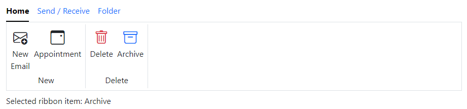
<Ribbon OnClick="OnRibbonItemClick">
    <RibbonTab Title="Home" IsActive="true">
        <Content>
            <!-- New -->
            <RibbonItemGroup Text="New">
                <RibbonItem Name="NewEmail" IconName="IconName.EnvelopePlus" IconSize="IconSize.x3" IsFirstItem="true">New<br />Email</RibbonItem>
                <RibbonItem Name="Appointment" IconName="IconName.Calendar3Event" IconSize="IconSize.x3" Text="Appointment" IsLastItem="true" />
            </RibbonItemGroup>
            <!-- Delete -->
            <RibbonItemGroup Text="Delete">
                <RibbonItem Name="Delete" IconColor="IconColor.Danger" IconName="IconName.Trash" IconSize="IconSize.x3" Text="Delete" IsFirstItem="true" />
                <RibbonItem Name="Archive" IconColor="IconColor.Primary" IconName="IconName.Archive" IconSize="IconSize.x3" Text="Archive" IsLastItem="true" />
            </RibbonItemGroup>
        </Content>
    </RibbonTab>
    <RibbonTab Title="Send / Receive">
        <Content>
            <!-- Send & Receive -->
            <RibbonItemGroup Text="Send & Receive">
                <RibbonItem Name="SendReceiveAllFolders" IconColor="IconColor.Success" IconName="IconName.EnvelopePlus" IconSize="IconSize.x3" IsFirstItem="true">Send/Receive<br />All Folders</RibbonItem>
                <RibbonItem Name="UpdateFolder" IconColor="IconColor.Primary" IconName="IconName.Calendar3Event" IconSize="IconSize.x3" IsLastItem="true">Update<br />Folder</RibbonItem>
            </RibbonItemGroup>
            <!-- Download -->
            <RibbonItemGroup Text="Download">
                <RibbonItem Name="ShowProgress" IconColor="IconColor.Success" IconName="IconName.Trash" IconSize="IconSize.x3" IsFirstItem="true">Show<br />Progress</RibbonItem>
                <RibbonItem Name="CancelAll" IconColor="IconColor.Primary" IconName="IconName.XSquareFill" IconSize="IconSize.x3" IsLastItem="true">Cancel<br />All</RibbonItem>
            </RibbonItemGroup>
        </Content>
    </RibbonTab>
    <RibbonTab Title="Folder">
        <Content>
            <!-- New -->
            <RibbonItemGroup Text="New">
                <RibbonItem Name="NewFolder" IconColor="IconColor.Success" IconName="IconName.FolderPlus" IconSize="IconSize.x3" IsFirstItem="true">New<br />Folder</RibbonItem>
                <RibbonItem Name="NewSearchFolder" IconColor="IconColor.Primary" IconName="IconName.Search" IconSize="IconSize.x3" IsLastItem="true">New<br />Search Folder</RibbonItem>
            </RibbonItemGroup>
            <!-- Actions -->
            <RibbonItemGroup Text="Actions">
                <RibbonItem Name="RenameFolder" IconColor="IconColor.Success" IconName="IconName.CursorText" IconSize="IconSize.x3" IsFirstItem="true">Rename<br />Folder</RibbonItem>
                <RibbonItem Name="CopyFolder" IconColor="IconColor.Primary" IconName="IconName.Copy" IconSize="IconSize.x3">Copy<br />Folder</RibbonItem>
                <RibbonItem Name="MoveFolder" IconColor="IconColor.Primary" IconName="IconName.ArrowRight" IconSize="IconSize.x3">Move<br />Folder</RibbonItem>
                <RibbonItem Name="DeleteFolder" IconColor="IconColor.Primary" IconName="IconName.FolderX" IconSize="IconSize.x3" IsLastItem="true">Delete<br />Folder</RibbonItem>
            </RibbonItemGroup>
        </Content>
    </RibbonTab>
</Ribbon>

<div class="mt-2">
    Selected ribbon item: @selectedRibbonItem
</div>
@code {
    string? selectedRibbonItem;

    private void OnRibbonItemClick(RibbonItemEventArgs args)
    {
        selectedRibbonItem = args.Name;
    }
}
Other icons
In the following example, instead of icons like Bootstrap, Font Awesome, etc., we used PNG icons.

<Ribbon OnClick="OnRibbonItemClick">
    <RibbonTab Title="Home">
        <Content>
            <!-- New -->
            <RibbonItemGroup Text="New">
                <RibbonItem Name="NewEmail" ImgSrc="/_content/BlazorBootstrap.Demo.RCL/icons/new-email.png" IsFirstItem="true">New<br />Email</RibbonItem>
                <RibbonItem Name="Appointment" ImgSrc="/_content/BlazorBootstrap.Demo.RCL/icons/calendar.png" Text="Appointment" IsLastItem="true" />
            </RibbonItemGroup>
            <!-- Delete -->
            <RibbonItemGroup Text="Delete">
                <RibbonItem Name="Delete" ImgSrc="/_content/BlazorBootstrap.Demo.RCL/icons/bin.png" Text="Delete" IsFirstItem="true" />
                <RibbonItem Name="Archive" ImgSrc="/_content/BlazorBootstrap.Demo.RCL/icons/archive.png" Text="Archive" IsLastItem="true" />
            </RibbonItemGroup>
        </Content>
    </RibbonTab>
    <RibbonTab Title="Send / Receive" IsActive="true">
        <Content>
            <!-- Send & Receive -->
            <RibbonItemGroup Text="Send & Receive">
                <RibbonItem Name="SendReceiveAllFolders" ImgSrc="/_content/BlazorBootstrap.Demo.RCL/icons/refresh.png" IsFirstItem="true">Send/Receive<br />All Folders</RibbonItem>
                <RibbonItem Name="UpdateFolder" ImgSrc="/_content/BlazorBootstrap.Demo.RCL/icons/folder-sync.png" IsLastItem="true">Update<br />Folder</RibbonItem>
            </RibbonItemGroup>
            <!-- Download -->
            <RibbonItemGroup Text="Download">
                <RibbonItem Name="ShowProgress" ImgSrc="/_content/BlazorBootstrap.Demo.RCL/icons/loading-bar.png" IsFirstItem="true">Show<br />Progress</RibbonItem>
                <RibbonItem Name="CancelAll" ImgSrc="/_content/BlazorBootstrap.Demo.RCL/icons/cancelled.png" IsLastItem="true">Cancel<br />All</RibbonItem>
            </RibbonItemGroup>
        </Content>
    </RibbonTab>
    <RibbonTab Title="Folder" IsActive="true">
        <Content>
            <!-- New -->
            <RibbonItemGroup Text="New">
                <RibbonItem Name="NewFolder" ImgSrc="/_content/BlazorBootstrap.Demo.RCL/icons/folder-add.png" IsFirstItem="true">New<br />Folder</RibbonItem>
                <RibbonItem Name="NewSearchFolder" ImgSrc="/_content/BlazorBootstrap.Demo.RCL/icons/folder-search.png" IsLastItem="true">New<br />Search Folder</RibbonItem>
            </RibbonItemGroup>
            <!-- Actions -->
            <RibbonItemGroup Text="Actions">
                <RibbonItem Name="RenameFolder" ImgSrc="/_content/BlazorBootstrap.Demo.RCL/icons/folder-rename.png" IsFirstItem="true">Rename<br />Folder</RibbonItem>
                <RibbonItem Name="CopyFolder" ImgSrc="/_content/BlazorBootstrap.Demo.RCL/icons/folder-copy.png">Copy<br />Folder</RibbonItem>
                <RibbonItem Name="MoveFolder" ImgSrc="/_content/BlazorBootstrap.Demo.RCL/icons/folder-move.png">Move<br />Folder</RibbonItem>
                <RibbonItem Name="DeleteFolder" ImgSrc="/_content/BlazorBootstrap.Demo.RCL/icons/folder-delete.png" IsLastItem="true">Delete<br />Folder</RibbonItem>
            </RibbonItemGroup>
        </Content>
    </RibbonTab>
</Ribbon>

<div class="mt-2">
    Selected ribbon item: @selectedRibbonItem
</div>
@code {
    string? selectedRibbonItem;

    private void OnRibbonItemClick(RibbonItemEventArgs args)
    {
        selectedRibbonItem = args.Name;
    }
}
NOTE
All the PNG icons used on this page are from Flaticon with a premium license only.