Blazor Tabs
Documentation and examples for using Blazor Bootstrap Tabs components.
Tabs Parameters
| Name | Type | Default | Required | Description | Added Version |
|---|---|---|---|---|---|
| ChildContent | RenderFragment | null | ✔️ | Gets or sets the content to be rendered within the component. | 1.0.0 |
| EnableFadeEffect | bool | false | Gets or sets the tabs fade effect. | 1.0.0 | |
| NavStyle | NavStyle | NavStyle.Tabs | Get or sets the nav style. | 1.0.0 |
Tabs Methods
| Name | Description | Added Version |
|---|---|---|
| GetActiveTab() | Gets the active tab. | 3.0.0 |
| InitializeRecentTab(bool showTab) | Initializes the most recently added tab, optionally displaying it. | 1.11.0 |
| RemoveTabByIndex(int tabIndex) | Removes the tab by index. | 2.2.0 |
| RemoveTabByName(string tabName) | Removes the tab by name. | 2.2.0 |
| ShowFirstTabAsync() | Selects the first tab and show its associated pane. | 1.0.0 |
| ShowLastTabAsync() | Selects the last tab and show its associated pane. | 1.0.0 |
| ShowRecentTab() | Shows the recently added tab. | 2.2.0 |
| ShowTabByIndexAsync(int tabIndex) | Selects the tab by index and show its associated pane. | 1.0.0 |
| ShowTabByNameAsync(string tabName) | Selects the tab by name and show its associated pane. | 1.0.0 |
Tabs Callback Events
| Event | Description | Added Version |
|---|---|---|
| OnHidden | This event fires after a new tab is shown (and thus the previous active tab is hidden). | 1.0.0 |
| OnHiding | This event fires when a new tab is to be shown (and thus the previous active tab is to be hidden). | 1.0.0 |
| OnShowing | This event fires on tab show, but before the new tab has been shown. | 1.0.0 |
| OnShown | This event fires on tab show after a tab has been shown. | 1.0.0 |
Tab Parameters
| Name | Type | Default | Required | Description | Added Version |
|---|---|---|---|---|---|
| Active | bool | false | Gets or sets the active state. | 1.0.0 | |
| Content | RenderFragment | null | ✔️ | Gets or sets the content to be rendered within the component. | 1.0.0 |
| Disabled | bool | false | Gets or sets the disabled state. | 1.0.0 | |
| Name | string | null | Gets or sets the tab name. | 1.0.0 | |
| Title | string | null | Gets or sets the tab title. | 1.0.0 | |
| TitleTemplate | RenderFragment | null | Gets or sets the tab title template. | 1.0.0 |
Either Title or TitleTemplate is required.
Tab Callback Events
| Event | Description | Added Version |
|---|---|---|
| OnClick | This event fires when the user clicks the corresponding tab button and the tab is displayed. | 1.11.0 |
Examples
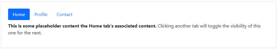
Tabs

<Tabs>
    <Tab Title="Home" IsActive="true">
        <Content>
            <p class="mt-2">
                <b>This is some placeholder content the Home tab's associated content.</b> Clicking another tab will toggle the visibility of this one for the next.
            </p>
        </Content>
    </Tab>
    <Tab Title="Profile">
        <Content>
            <p class="mt-2">
                <b>This is some placeholder content the Profile tab's associated content.</b> Clicking another tab will toggle the visibility of this one for the next.
            </p>
        </Content>
    </Tab>
    <Tab Title="Contact">
        <Content>
            <p class="mt-2">
                <b>This is some placeholder content the Contact tab's associated content.</b> Clicking another tab will toggle the visibility of this one for the next.
            </p>
        </Content>
    </Tab>
</Tabs>
Fade effect
To create a fade-in effect for tabs, add the EnableFadeEffect="true" parameter. Additionally, set the IsActive="true" parameter on the first tab pane to display its content initially.
<Tabs EnableFadeEffect="true">
    <Tab Title="Home" IsActive="true">
        <Content>
            <p class="mt-2">
                <b>This is some placeholder content the Home tab's associated content.</b> Clicking another tab will toggle the visibility of this one for the next.
            </p>
        </Content>
    </Tab>
    <Tab Title="Profile">
        <Content>
            <p class="mt-2">
                <b>This is some placeholder content the Profile tab's associated content.</b> Clicking another tab will toggle the visibility of this one for the next.
            </p>
        </Content>
    </Tab>
    <Tab Title="Contact">
        <Content>
            <p class="mt-2">
                <b>This is some placeholder content the Contact tab's associated content.</b> Clicking another tab will toggle the visibility of this one for the next.
            </p>
        </Content>
    </Tab>
</Tabs>
Title with icon
To customize the tab title, use the TitleTemplate parameter, as demonstrated in the following example.

<Tabs EnableFadeEffect="true">
    <Tab IsActive="true">
        <TitleTemplate>
            <Icon Name="IconName.HouseFill" /> Home
        </TitleTemplate>
        <Content>
            <p class="mt-2">
                <b>This is some placeholder content the Home tab's associated content.</b> Clicking another tab will toggle the visibility of this one for the next.
            </p>
        </Content>
    </Tab>
    <Tab>
        <TitleTemplate>
            <Icon Name="IconName.PersonFill" /> Profile
        </TitleTemplate>
        <Content>
            <p class="mt-2">
                <b>This is some placeholder content the Profile tab's associated content.</b> Clicking another tab will toggle the visibility of this one for the next.
            </p>
        </Content>
    </Tab>
    <Tab>
        <TitleTemplate>
            <Icon Name="IconName.PhoneFill" /> Contact
        </TitleTemplate>
        <Content>
            <p class="mt-2">
                <b>This is some placeholder content the Contact tab's associated content.</b> Clicking another tab will toggle the visibility of this one for the next.
            </p>
        </Content>
    </Tab>
</Tabs>
Disable Tab
Disable specific tabs by adding Disabled="true" parameter.

<Tabs EnableFadeEffect="true">
    <Tab Title="Home" IsActive="true">
        <Content>
            <p class="mt-2">
                <b>This is some placeholder content the Home tab's associated content.</b> Clicking another tab will toggle the visibility of this one for the next.
            </p>
        </Content>
    </Tab>
    <Tab Title="Profile">
        <Content>
            <p class="mt-2">
                <b>This is some placeholder content the Profile tab's associated content.</b> Clicking another tab will toggle the visibility of this one for the next.
            </p>
        </Content>
    </Tab>
    <Tab Title="Projects" Disabled="true">
        <Content>
            <p class="mt-2">
                <b>This is some placeholder content the Projects tab's associated content.</b> Clicking another tab will toggle the visibility of this one for the next.
            </p>
        </Content>
    </Tab>
    <Tab Title="Contact">
        <Content>
            <p class="mt-2">
                <b>This is some placeholder content the Contact tab's associated content.</b> Clicking another tab will toggle the visibility of this one for the next.
            </p>
        </Content>
    </Tab>
</Tabs>
Pills
To transform the tabs into pills, use the parameter NavStyle="NavStyle.Pills".
<Tabs EnableFadeEffect="true" NavStyle="NavStyle.Pills">
    <Tab Title="Home" IsActive="true">
        <Content>
            <p class="mt-2">
                <b>This is some placeholder content the Home tab's associated content.</b> Clicking another tab will toggle the visibility of this one for the next.
            </p>
        </Content>
    </Tab>
    <Tab Title="Profile">
        <Content>
            <p class="mt-2">
                <b>This is some placeholder content the Profile tab's associated content.</b> Clicking another tab will toggle the visibility of this one for the next.
            </p>
        </Content>
    </Tab>
    <Tab Title="Contact">
        <Content>
            <p class="mt-2">
                <b>This is some placeholder content the Contact tab's associated content.</b> Clicking another tab will toggle the visibility of this one for the next.
            </p>
        </Content>
    </Tab>
</Tabs>
Underline
Use the NavStyle="NavStyle.Underline" parameter to change the tabs to an underlined style.

<Tabs EnableFadeEffect="true" NavStyle="NavStyle.Underline">
    <Tab Title="Home" IsActive="true">
        <Content>
            <p class="mt-3">This is the placeholder content for the <b>Home</b> tab.</p>
        </Content>
    </Tab>
    <Tab Title="Profile">
        <Content>
            <p class="mt-3">This is the placeholder content for the <b>Profile</b> tab.</p>
        </Content>
    </Tab>
    <Tab Title="Contact">
        <Content>
            <p class="mt-3">This is the placeholder content for the <b>Contact</b> tab.</p>
        </Content>
    </Tab>
</Tabs>
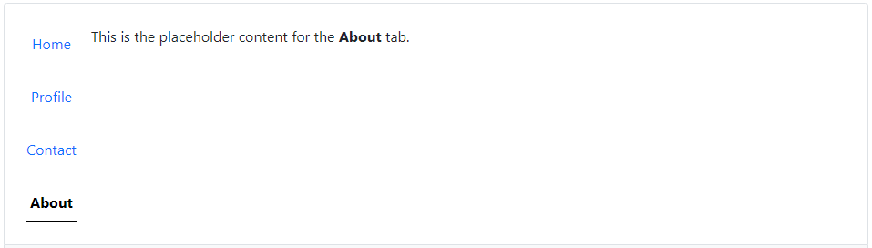
Vertical
Display your tabs vertically by setting the NavStyle parameter to NavStyle.Vertical.

<Tabs NavStyle="NavStyle.Vertical">
    <Tab Title="Home" IsActive="true">
        <Content>
            <p class="ms-3">This is the placeholder content for the <b>Home</b> tab.</p>
        </Content>
    </Tab>
    <Tab Title="Profile">
        <Content>
            <p class="ms-3">This is the placeholder content for the <b>Profile</b> tab.</p>
        </Content>
    </Tab>
    <Tab Title="Contact">
        <Content>
            <p class="ms-3">This is the placeholder content for the <b>Contact</b> tab.</p>
        </Content>
    </Tab>
    <Tab Title="About">
        <Content>
            <p class="ms-3">This is the placeholder content for the <b>About</b> tab.</p>
        </Content>
    </Tab>
</Tabs>
Vertical pills

<Tabs NavStyle="NavStyle.VerticalPills">
    <Tab Title="Home" IsActive="true">
        <Content>
            <p class="ms-3">This is the placeholder content for the <b>Home</b> tab.</p>
        </Content>
    </Tab>
    <Tab Title="Profile">
        <Content>
            <p class="ms-3">This is the placeholder content for the <b>Profile</b> tab.</p>
        </Content>
    </Tab>
    <Tab Title="Contact">
        <Content>
            <p class="ms-3">This is the placeholder content for the <b>Contact</b> tab.</p>
        </Content>
    </Tab>
    <Tab Title="About">
        <Content>
            <p class="ms-3">This is the placeholder content for the <b>About</b> tab.</p>
        </Content>
    </Tab>
</Tabs>
Vertical underline
<Tabs NavStyle="NavStyle.VerticalUnderline">
    <Tab Title="Home" IsActive="true">
        <Content>
            <p class="ms-3">This is the placeholder content for the <b>Home</b> tab.</p>
        </Content>
    </Tab>
    <Tab Title="Profile">
        <Content>
            <p class="ms-3">This is the placeholder content for the <b>Profile</b> tab.</p>
        </Content>
    </Tab>
    <Tab Title="Contact">
        <Content>
            <p class="ms-3">This is the placeholder content for the <b>Contact</b> tab.</p>
        </Content>
    </Tab>
    <Tab Title="About">
        <Content>
            <p class="ms-3">This is the placeholder content for the <b>About</b> tab.</p>
        </Content>
    </Tab>
</Tabs>
Activate individual tabs
You can activate individual tabs in several ways. Use predefined methods such as ShowFirstTabAsync, ShowLastTabAsync, ShowTabByIndexAsync, and ShowTabByNameAsync, as shown below.

<Tabs @ref="tabs" EnableFadeEffect="true">
    <Tab Title="Home" IsActive="true">
        <Content>
            <p class="mt-3">This is the placeholder content for the <b>Home</b> tab.</p>
        </Content>
    </Tab>
    <Tab Title="Profile">
        <Content>
            <p class="mt-3">This is the placeholder content for the <b>Profile</b> tab.</p>
        </Content>
    </Tab>
    <Tab Title="Contact">
        <Content>
            <p class="mt-3">This is the placeholder content for the <b>Contact</b> tab.</p>
        </Content>
    </Tab>
    <Tab Title="Products" Name="Products">
        <Content>
            <p class="mt-3">This is the placeholder content for the <b>Products</b> tab.</p>
        </Content>
    </Tab>
    <Tab Title="FAQs" Name="FAQ">
        <Content>
            <p class="mt-3">This is the placeholder content for the <b>FAQs</b> tab.</p>
        </Content>
    </Tab>
    <Tab Title="About">
        <Content>
            <p class="mt-3">This is the placeholder content for the <b>About</b> tab.</p>
        </Content>
    </Tab>
</Tabs>

<Button Color="ButtonColor.Primary" @onclick="ShowFirstTabAsync">First Tab</Button>
<Button Color="ButtonColor.Primary" @onclick="ShowSecondTabAsync">Second Tab</Button>
<Button Color="ButtonColor.Primary" @onclick="ShowThirdTabAsync">Third Tab</Button>
<Button Color="ButtonColor.Primary" @onclick="ShowProductsTabAsync">Products Tab</Button>
<Button Color="ButtonColor.Primary" @onclick="ShowFaqsAsync">FAQs Tab</Button>
<Button Color="ButtonColor.Primary" @onclick="ShowLastTabAsync">Last Tab</Button>
@code{
    Tabs tabs;

    private async Task ShowFirstTabAsync() => await tabs.ShowFirstTabAsync();
    private async Task ShowSecondTabAsync() => await tabs.ShowTabByIndexAsync(1);
    private async Task ShowThirdTabAsync() => await tabs.ShowTabByIndexAsync(2);
    private async Task ShowProductsTabAsync() => await tabs.ShowTabByNameAsync("Products");
    private async Task ShowFaqsAsync() => await tabs.ShowTabByNameAsync("FAQ");
    private async Task ShowLastTabAsync() => await tabs.ShowLastTabAsync();
}
Events
When displaying a new tab, the events fire in the following sequence:
OnHiding(on the currently active tab)OnShowing(on the tab that is about to be displayed)OnHidden(on the previously active tab, which is the same one that triggered theOnHidingevent)OnShown(on the newly activated tab that has just been displayed, which is the same one that triggered theOnShowingevent)
If no tab was already active, then the OnHiding and OnHidden events will not be fired.
Methods: Set active tab OnAfterRender
<Tabs @ref="tabs">
    <Tab Title="Home">
        <Content>
            <p class="mt-3">This is the placeholder content for the <b>Home</b> tab.</p>
        </Content>
    </Tab>
    <Tab Title="Profile">
        <Content>
            <p class="mt-3">This is the placeholder content for the <b>Profile</b> tab.</p>
        </Content>
    </Tab>
    <Tab Title="Contact">
        <Content>
            <p class="mt-3">This is the placeholder content for the <b>Contact</b> tab.</p>
        </Content>
    </Tab>
    <Tab Title="About">
        <Content>
            <p class="mt-3">This is the placeholder content for the <b>About</b> tab.</p>
        </Content>
    </Tab>
</Tabs>
@code {
    Tabs tabs = default!;

    protected override async Task OnAfterRenderAsync(bool firstRender)
    {
        if (firstRender)
        {
            string userDefaultPreferredTab = "Profile"; // Get the value from Service / API

            switch (userDefaultPreferredTab)
            {
                case "Home":
                    await tabs.ShowTabByIndexAsync(0);
                    break;
                case "Profile":
                    await tabs.ShowTabByIndexAsync(1);
                    break;
                case "Contact":
                    await tabs.ShowTabByIndexAsync(2);
                    break;
                case "About":
                    await tabs.ShowTabByIndexAsync(3);
                    break;
                default:
                    await tabs.ShowTabByIndexAsync(0);
                    break;
            }
        }
    }
}
Tab: OnClick

<Tabs>
    @foreach (var customer in customers)
    {
        <Tab Title="@customer.CustomerName"
             IsActive="selectedCustomer.CustomerId == customer.CustomerId"
             OnClick="(args) => OnTabClick(args, customer)">
            <Content>
                <div class="mt-3">
                    This is the placeholder content for the <b>@customer.CustomerName</b> tab.
                </div>
            </Content>
        </Tab>
    }
</Tabs>

@if (selectedCustomer is not null)
{
    <div class="mt-3">Selected customer: <b>@selectedCustomer.CustomerName</b></div>
}
@code {
    private List<Customer> customers = new() { new(1, "Marvin Klein"), new(2, "Vikram Reddy"), new(3, "Bandita PA"), new(4, "Daina JJ") };

    private Customer selectedCustomer = default!;

    protected override void OnInitialized() => selectedCustomer = customers.First();

    private void OnTabClick(TabEventArgs args, Customer customer) => selectedCustomer = customer;
}
Dynamic tabs

<div class="d-flex flex-column">
    <div>
        <Button Color="ButtonColor.Success" Class="mb-3 float-end" Size="Size.ExtraSmall" @onclick="AddCustomer">+ Add customer</Button>
    </div>
    <Card>
        <CardBody>
            <Tabs @ref="tabsRef">
                @foreach (var customer in customers)
                {
                    <Tab Title="@customer.CustomerName">
                        <Content>
                            <div class="mt-3">
                                This is the placeholder content for the <b>@customer.CustomerName</b> tab.
                            </div>
                        </Content>
                    </Tab>
                }
            </Tabs>
        </CardBody>
    </Card>
</div>
@code {
    Tabs tabsRef = default!;

    private List<Customer> customers = default!;

    protected override void OnInitialized()
    {
        customers = new() { new(1, "Marvin Klein"), new(2, "Vikram Reddy"), new(3, "Bandita PA"), new(4, "Daina JJ") };
    }

    private void AddCustomer()
    {
        var count = customers.Count;
        var customer = new Customer(count + 1, $"Customer {count + 1}");
        customers.Add(customer);

        tabsRef.ShowRecentTab();
    }
}
Remove dynamic tabs
In the following example, we are deleting tabs dynamically. Ensure that the @key parameter is added with unique value.

<div class="d-flex flex-column">
    <div>
        <Button Color="ButtonColor.Success" Class="mb-3 float-end" Size="Size.ExtraSmall" @onclick="AddCustomer">+ Add customer</Button>
    </div>
    <Card>
        <CardBody>
            <Tabs @ref="tabsRef">
                @foreach (var customer in customers)
                {
                    <Tab @key="@customer?.GetHashCode()"
                         Title="@customer.CustomerName"
                         Name="@($"{customer.CustomerId}")">
                        <Content>
                            <div class="p-1">
                                <div class="mt-3">
                                    This is the placeholder content for the <b>@customer.CustomerName</b> tab.
                                </div>
                                <div>
                                    <Button Color="ButtonColor.Danger" Class="mt-3" Size="Size.ExtraSmall" @onclick="() => RemoveCustomer(customer)">Remove tab</Button>
                                </div>
                            </div>
                        </Content>
                    </Tab>
                }
            </Tabs>
        </CardBody>
    </Card>
</div>
@code {
    Tabs tabsRef = default!;

    int count = 1;
    private List<Customer> customers = default!;

    protected override void OnInitialized()
    {
        customers = new() { new(1, "Marvin Klein"), new(2, "Vikram Reddy"), new(3, "Bandita PA"), new(4, "Daina JJ") };
        var count = customers.Count;
    }

    private void AddCustomer()
    {
        count++;
        var customer = new Customer(count, $"Customer {count}");
        customers.Add(customer);

        tabsRef.ShowRecentTab();
    }

    private void RemoveCustomer(Customer customer)
    {
        customers.Remove(customer);

        tabsRef.RemoveTabByName(customer.CustomerId.ToString());
    }
}
Remove inactive tab
In the following example, we are removing the inactive tab by name. The focus will not be lost with this active tab.

<div class="d-flex flex-column">
    <Card>
        <CardBody>
            <Tabs @ref="tabsRef">
                @foreach (var customer in customers)
                {
                    <Tab @key="@customer?.GetHashCode()"
                         Title="@customer.CustomerName"
                         Name="@($"{customer.CustomerId}")">
                        <Content>
                            <div class="p-1">
                                <div class="mt-3">
                                    This is the placeholder content for the <b>@customer.CustomerName</b> tab.
                                </div>
                            </div>
                        </Content>
                    </Tab>
                }
            </Tabs>
        </CardBody>
    </Card>
</div>
<div>
    <Button Color="ButtonColor.Success" Class="my-3" Size="ButtonSize.ExtraSmall" @onclick="RemoveCustomerVikram">x Remove Vikram Reddy Tab</Button>
</div>
@code {
    Tabs tabsRef = default!;

    int count = 1;
    private List<Customer> customers = default!;

    protected override void OnInitialized()
    {
        customers = new() {
            new(1, "Marvin Klein"),
            new(2, "Vikram Reddy"),
            new(3, "Bandita PA"),
            new(4, "Dan H"),
            new(5, "Joe JJ"),
            new(6, "Rose KK")
        };
        count = customers.Count;
    }

    private void RemoveCustomerVikram()
    {
        var customer = customers.FirstOrDefault(c => c.CustomerName == "Vikram Reddy");
        if (customer != null)
        {
            customers.Remove(customer);
            tabsRef.RemoveTabByName(customer.CustomerId.ToString());
        }
    }
}