Blazor Confirm Dialog
Use Blazor Bootstrap confirm dialog component if you want the user to verify or accept something.

Methods
| Name | Return Type | Description | Added Version |
|---|---|---|---|
| ShowAsync(string title, string message1, ConfirmDialogOptions confirmDialogOptions = null) | Task<bool> | Shows confirm dialog. | 1.1.0 |
| ShowAsync(string title, string message1, string message2, ConfirmDialogOptions confirmDialogOptions = null) | Task<bool> | Shows confirm dialog. | 1.1.0 |
| ShowAsync<T>(string title, Dictionary<string, object> parametres = null, ConfirmDialogOptions confirmDialogOptions = null) | Task<bool> | Shows confirm dialog. T is component. | 1.1.0 |
ConfirmDialogOptions Properties
| Name | Type | Default | Description | Added Version |
|---|---|---|---|---|
| DialogCssClass | string | null | Additional CSS class for the dialog (div.modal-dialog element). | 1.1.0 |
| Dismissable | bool | false | Adds a dismissable close button to the confirm dialog. | 1.1.0 |
| HeaderCssClass | string | null | Additional header CSS class (div.modal-header element). | 1.1.0 |
| IsScrollable | bool | false | Allows confirm dialog body to be scrollable. | 1.1.0 |
| IsVerticallyCentered | bool | false | Shows the confirm dialog vertically in the center of the page. | 1.1.0 |
| NoButtonColor | ButtonColor | ButtonColor.Secondary | Gets or sets the 'No' button color. | 1.1.0 |
| NoButtonText | string | No | Gets or sets the 'No' button text. | 1.1.0 |
| Size | DialogSize | ModalSize.Regular | Size of the modal. | 1.1.0 |
| YesButtonColor | ButtonColor | ButtonColor.Primary | Gets or sets the 'Yes' button color. | 1.1.0 |
| YesButtonText | string | Yes | Gets or sets the 'Yes' button text. | 1.1.0 |
Examples
Confirm Dialog
<ConfirmDialog @ref="dialog" />

<Button Color="ButtonColor.Danger" @onclick="ShowConfirmationAsync"> Delete Employee </Button>
@code {
    private ConfirmDialog dialog;

    private async Task ShowConfirmationAsync()
    {
        var confirmation = await dialog.ShowAsync(
            title: "Are you sure you want to delete this?",
            message1: "This will delete the record. Once deleted can not be rolled back.",
            message2: "Do you want to proceed?");

        if (confirmation)
        {
            // do whatever
        }
        else
        {
            // do whatever
        }
    }
}
Dynamic component as confirm dialog
Render different components dynamically within the confirm dialog without iterating through possible types or using conditional logic.
If dynamically-rendered components have component parameters, pass them as an IDictionary. The string is the parameter's name, and the object is the parameter's value.
In the below example, we used Toast Service to show the user confirmation.

<ConfirmDialog @ref="dialog" />

<Button Color="ButtonColor.Danger" @onclick="DeleteEmployeeAsync"> Delete Employee </Button>
@code {
    private ConfirmDialog dialog;

    [Inject] ToastService ToastService { get; set; }

    private async Task DeleteEmployeeAsync()
    {
        var parameters = new Dictionary<string, object>();
        parameters.Add("EmployeeId", 321);

        var confirmation = await dialog.ShowAsync<EmployeeDemoComponent>("Are you sure you want to delete this employee?", parameters);

        if (confirmation)
        {
            // call API to delete the employee
            // show acknowledgment to the user
            ToastService.Notify(new ToastMessage(ToastType.Success, $"Employee deleted successfully."));
        }
        else
            ToastService.Notify(new ToastMessage(ToastType.Secondary, $"Delete action canceled."));
    }
}
EmployeeDemoComponent.razor
<div class="row">
    <div class="col-5 col-md-3 text-end">Employee Id :</div>
    <div class="col-7 col-md-9">@EmployeeId</div>
</div>
<div class="row">
    <div class="col-5 col-md-3 text-end">First Name :</div>
    <div class="col-7 col-md-9">@employee.FirstName</div>
</div>
<div class="row">
    <div class="col-5 col-md-3 text-end">Last Name :</div>
    <div class="col-7 col-md-9">@employee.LastName</div>
</div>

@code {
    private Employee employee;

    [Parameter] public int EmployeeId { get; set; }

    protected override void OnInitialized()
    {
        // get employee with {EmployeeId} from DB

        employee = new Employee { FirstName = "Vikram", LastName = "Reddy" };

        base.OnInitialized();
    }
}
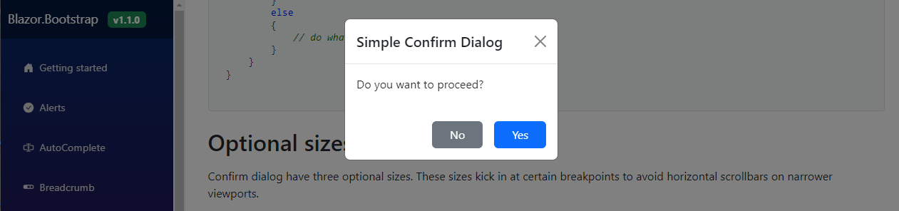
Change buttons text and color
Use ConfirmDialogOptions to change the text and color of the button.

<ConfirmDialog @ref="dialog" />

<Button Color="ButtonColor.Primary" @onclick="ShowSaveConfirmationAsync"> Save Employee </Button>
@code {
    private ConfirmDialog dialog;

    private async Task ShowSaveConfirmationAsync()
    {
        var options = new ConfirmDialogOptions
            {
                YesButtonText = "OK",
                YesButtonColor = ButtonColor.Success,
                NoButtonText = "CANCEL",
                NoButtonColor = ButtonColor.Danger
            };

        var confirmation = await dialog.ShowAsync(
            title: "Simple Confirm Dialog",
            message1: "Do you want to proceed?",
            confirmDialogOptions: options);

        if (confirmation)
        {
            // do whatever
        }
        else
        {
            // do whatever
        }
    }
}
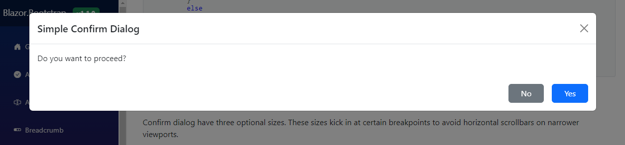
Optional sizes
Confirm dialog have three optional sizes. These sizes kick in at certain breakpoints to avoid horizontal scrollbars on narrower viewports.
Confirm Dialog Component - Small Size
Confirm Dialog Component - Large Size

Confirm Dialog Component - Extra Large Size
<ConfirmDialog @ref="dialog" />

<Button Color="ButtonColor.Primary" @onclick="() => ShowConfirmationAsync(DialogSize.Small)"> Small Confirm Dialog </Button>
<Button Color="ButtonColor.Primary" @onclick="() => ShowConfirmationAsync(DialogSize.Large)"> Large Confirm Dialog </Button>
<Button Color="ButtonColor.Primary" @onclick="() => ShowConfirmationAsync(DialogSize.ExtraLarge)"> Extra Large Confirm Dialog </Button>
@code {
    private ConfirmDialog dialog;

    private async Task ShowConfirmationAsync(DialogSize size)
    {
        var options = new ConfirmDialogOptions { Size = size };

        var confirmation = await dialog.ShowAsync(
            title: "Simple Confirm Dialog",
            message1: "Do you want to proceed?",
            confirmDialogOptions: options);

        if (confirmation)
        {
            // do whatever
        }
        else
        {
            // do whatever
        }
    }
}
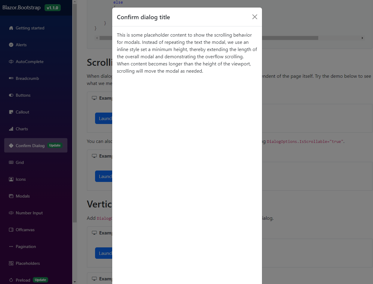
Scrolling long content
When dialogs become too long for the user's viewport or device, they scroll independent of the page itself. Try the demo below to see what we mean.
<ConfirmDialog @ref="dialog" />

<Button Color="ButtonColor.Primary" @onclick="ShowDialogAsync"> Launch Confirm Dialog </Button>
@code {
    private ConfirmDialog dialog;

    private async Task ShowDialogAsync()
    {
        var confirmation = await dialog.ShowAsync<LongContentDemoComponent>(title: "Confirm dialog title");

        if (confirmation)
        {
            // do whatever
        }
        else
        {
            // do whatever
        }
    }
}
You can also create a scrollable dialog that allows scroll the dialog body by updating DialogOptions.IsScrollable="true".

<ConfirmDialog @ref="dialog" />

<Button Color="ButtonColor.Primary" @onclick="ShowDialogAsync"> Launch Confirm Dialog </Button>
@code {
    private ConfirmDialog dialog;

    private async Task ShowDialogAsync()
    {
        var options = new ConfirmDialogOptions { IsScrollable = true };
        var confirmation = await dialog.ShowAsync<LongContentDemoComponent>(
            title: "Confirm dialog title",
            confirmDialogOptions: options);

        if (confirmation)
        {
            // do whatever
        }
        else
        {
            // do whatever
        }
    }
}
Vertically centered
Add DialogOptions.IsVerticallyCentered="true" to vertically center the confirm dialog.

<ConfirmDialog @ref="dialog" />

<Button Color="ButtonColor.Primary" @onclick="ShowDialogAsync"> Launch Vertically Centered Confirm Dialog </Button>
@code {
    private ConfirmDialog dialog;

    private async Task ShowDialogAsync()
    {
        var options = new ConfirmDialogOptions { IsVerticallyCentered = true };
        var confirmation = await dialog.ShowAsync(
            title: "Simple Confirm Dialog",
            message1: "Do you want to proceed?",
            confirmDialogOptions: options);

        if (confirmation)
        {
            // do whatever
        }
        else
        {
            // do whatever
        }
    }
}
You can also create a scrollable dialog that allows scroll the dialog body by updating DialogOptions.IsScrollable="true".
<ConfirmDialog @ref="dialog" />

<Button Color="ButtonColor.Primary" @onclick="ShowDialogAsync"> Launch Scrollable & Vertically Centered Confirm Dialog </Button>
@code {
    private ConfirmDialog dialog;

    private async Task ShowDialogAsync()
    {
        var options = new ConfirmDialogOptions { IsScrollable = true, IsVerticallyCentered = true };
        var confirmation = await dialog.ShowAsync<LongContentDemoComponent>(title: "Confirm dialog title",
            confirmDialogOptions: options);

        if (confirmation)
        {
            // do whatever
        }
        else
        {
            // do whatever
        }
    }
}
Disable auto focus on the yes button
By default, auto focus on the "Yes" button is enabled.
To disabe the autofocus, set AutoFocusYesButton = false on the ConfirmDialogOptions.
<ConfirmDialog @ref="dialog" />

<Button Color="ButtonColor.Primary" @onclick="ShowDialogAsync"> Launch Confirm Dialog </Button>
@code {
    private ConfirmDialog dialog = default!;

    private async Task ShowDialogAsync()
    {
        var confirmation = await dialog.ShowAsync<LongContentDemoComponent>(
            title: "Confirm dialog title",
            confirmDialogOptions: new ConfirmDialogOptions { AutoFocusYesButton = false }
        );

        if (confirmation)
        {
            // do something
        }
        else
        {
            // do something
        }
    }
}