Blazor FileInput
The Blazor Bootstrap FileInput component follows the standard Bootstrap file-control presentation. It supports single or multiple files, per-file removal, validation, sizes, and accessible feedback. Use DragAndDropFileInput when a drop area is required.
Parameters
| Name | Type | Default | Description | Added Version |
|---|---|---|---|---|
| AllowedFileTypes | IEnumerable<string> | null | Allowed file extensions. Values can use .pdf or pdf and match case-insensitively. An empty collection allows every extension. | 4.0.0 |
| AriaLabel | string | Select files | Accessible label for the file control. | 4.0.0 |
| HintText | string | null | Help text displayed below the component. | 4.0.0 |
| InvalidFileTypeErrorMessage | string | {FileName}: the file extension is not allowed. | Invalid-extension message template. Supports {FileName} and {AllowedFileTypes}. | 4.0.0 |
| MaxFileCount | int | null | Maximum number of selected files. | 4.0.0 |
| MaxFileCountErrorMessage | string | {FileName}: the maximum number of files has been reached. | Maximum-count message template. Supports {FileName} and {MaxFileCount}. | 4.0.0 |
| MaxFileSize | long | null | Maximum file size in bytes. | 4.0.0 |
| MaxFileSizeErrorMessage | string | {FileName}: the file exceeds the maximum allowed size. | Maximum-size message template. Supports {FileName} and {MaxFileSize}. | 4.0.0 |
| Multiple | bool | false | Allows multiple files to be selected. | 4.0.0 |
| SingleFileErrorMessage | string | Only one file can be selected. | Single-file selection message template; no dynamic token applies. | 4.0.0 |
| Size | FileInputSize | FileInputSize.Default | Applies Bootstrap form-control-lg or form-control-sm sizing. | 4.0.0 |
Events
| Name | Description | Added Version |
|---|---|---|
| FilesChanged | Fires when the accepted selected-file list changes. | 4.0.0 |
Examples
Basic usage
Use the visible Bootstrap file control to open the native file picker.
<FileInput HintText="Select a file with the standard Bootstrap file control." />
Multiple files and removal
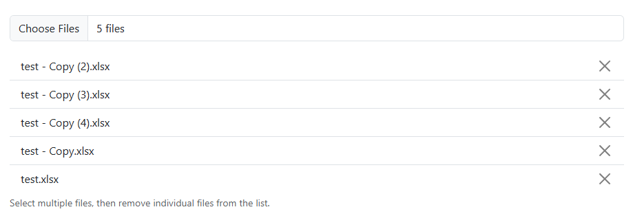
Set Multiple to show every accepted file. Each file has its own keyboard-accessible remove button, so removing one does not clear the others.
<FileInput Multiple="true"
           HintText="Select multiple files and remove them individually." />
Validation
AllowedFileTypes accepts extensions only. Values with or without a leading dot are equivalent, and matching is case-insensitive. Files that fail an extension, size, or count rule show a file-specific error; valid files from a mixed selection remain selected.
<FileInput Multiple="true"
           MaxFileCount="3"
           MaxFileSize="1048576"
           AllowedFileTypes="@allowedExtensions"
           HintText="Up to three PDF or PNG files, each no larger than 1 MB." />

@code {
    private readonly string[] allowedExtensions = [".pdf", "png"];
}
Validation message templates
Each validation message can be customized. The current messages remain the defaults. Use only the tokens that apply to the condition: {FileName} with file-specific errors, {MaxFileSize} for size errors, {AllowedFileTypes} for extension errors, and {MaxFileCount} for count errors. SingleFileErrorMessage is static and has no dynamic token.
<FileInput Multiple="true"
           InvalidFileTypeErrorMessage="{FileName} must use: {AllowedFileTypes}."
           MaxFileCountErrorMessage="{FileName} would exceed the {MaxFileCount}-file limit."
           MaxFileSizeErrorMessage="{FileName} exceeds the {MaxFileSize}-byte limit."
           SingleFileErrorMessage="Select only one file." />
Unrestricted extensions
Use an empty AllowedFileTypes collection when every extension is permitted. Other rules, such as MaxFileSize and MaxFileCount, still apply.
<FileInput Multiple="true"
           AllowedFileTypes="@allowedExtensions"
           MaxFileSize="5242880"
           HintText="Any extension is allowed; the 5 MB size limit still applies." />

@code {
    private readonly string[] allowedExtensions = [];
}
Sizes
Use Size to apply Bootstrap's form-control-lg or form-control-sm classes.
<FileInput Size="FileInputSize.Large"
           HintText="Large file input." />
Accessibility
Form validation
FileInput participates in an EditForm and reports file-selection validation errors alongside the form.
Provide a clear AriaLabel when the default label does not describe the expected files. FileInput announces validation errors through an alert region, and each selected file has an accessible, keyboard-operable remove button. For drag-and-drop with a touch-friendly native-picker fallback, use DragAndDropFileInput.