Blazor DragAndDropFileInput
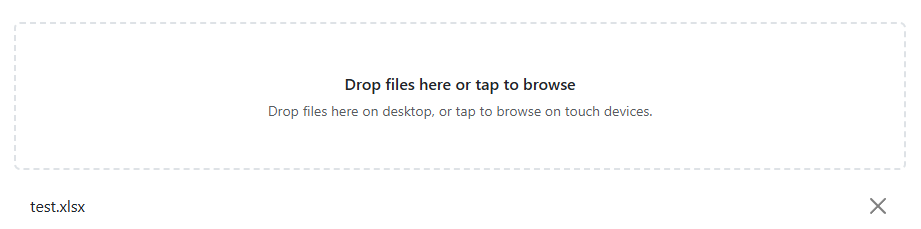
The Blazor Bootstrap DragAndDropFileInput component displays a file drop area. On desktop browsers, users can drop files onto the area. On touch browsers, tapping the area opens the native file picker. It supports the same selection, validation, feedback, and removal behavior as FileInput.
Parameters
| Name | Type | Default | Description | Added Version |
|---|---|---|---|---|
| AllowedFileTypes | IEnumerable<string> | null | Allowed file extensions. Values can use .pdf or pdf and match case-insensitively. An empty collection allows every extension. | 4.0.0 |
| AriaLabel | string | Select files | Accessible label for the drop area and native file picker. | 4.0.0 |
| BackgroundColor | BackgroundColor | BackgroundColor.None | Bootstrap contextual background color for the drop area. | 4.0.0 |
| HintText | string | null | Help text displayed in the drop area. | 4.0.0 |
| InvalidFileTypeErrorMessage | string | {FileName}: the file extension is not allowed. | Invalid-extension message template. Supports {FileName} and {AllowedFileTypes}. | 4.0.0 |
| MaxFileCount | int | null | Maximum number of selected files. | 4.0.0 |
| MaxFileCountErrorMessage | string | {FileName}: the maximum number of files has been reached. | Maximum-count message template. Supports {FileName} and {MaxFileCount}. | 4.0.0 |
| MaxFileSize | long | null | Maximum file size in bytes. | 4.0.0 |
| MaxFileSizeErrorMessage | string | {FileName}: the file exceeds the maximum allowed size. | Maximum-size message template. Supports {FileName} and {MaxFileSize}. | 4.0.0 |
| Multiple | bool | false | Allows multiple files to be selected. | 4.0.0 |
| SingleFileErrorMessage | string | Only one file can be selected. | Single-file selection message template; no dynamic token applies. | 4.0.0 |
Events
| Name | Description | Added Version |
|---|---|---|
| FilesChanged | Fires when the accepted selected-file list changes. | 4.0.0 |
Examples
Desktop drag-and-drop and touch selection
Drop a file onto the area in desktop browsers. On tablet and mobile touch browsers, tap the area to open the platform's native file picker.
<DragAndDropFileInput HintText="Drop files here on desktop, or tap to browse on touch devices." />
Validation
AllowedFileTypes accepts extensions only. Values with or without a leading dot are equivalent, and matching is case-insensitive. Files that fail an extension, size, or count rule show a file-specific error; valid files from a mixed selection remain selected.
<DragAndDropFileInput Multiple="true"
                      MaxFileCount="3"
                      MaxFileSize="1048576"
                      AllowedFileTypes="@allowedExtensions"
                      HintText="Up to three PDF or PNG files, each no larger than 1 MB." />

@code {
    private readonly string[] allowedExtensions = [".pdf", "png"];
}
Validation message templates
DragAndDropFileInput inherits the same validation-message templates as FileInput. The current messages remain the defaults. Use {FileName} for file-specific errors, {MaxFileSize} for size errors, {AllowedFileTypes} for extension errors, and {MaxFileCount} for count errors. SingleFileErrorMessage is static and has no dynamic token.
<DragAndDropFileInput Multiple="true"
                      InvalidFileTypeErrorMessage="{FileName} must use: {AllowedFileTypes}."
                      MaxFileCountErrorMessage="{FileName} would exceed the {MaxFileCount}-file limit."
                      MaxFileSizeErrorMessage="{FileName} exceeds the {MaxFileSize}-byte limit."
                      SingleFileErrorMessage="Select only one file." />
Background color
Use BackgroundColor to match the drop area to the surrounding Bootstrap interface.
<DragAndDropFileInput BackgroundColor="BackgroundColor.Light"
                      HintText="Drop files here or tap to browse." />
Accessibility
Form validation
DragAndDropFileInput participates in an EditForm and retains the same validation behavior whether files are dropped or selected through the native picker.
The native file input is visually hidden within the drop area but remains the selection control. It is therefore operable through touch, pointer, and keyboard activation. DragAndDropFileInput announces validation errors through an alert region, and each selected file has an accessible, keyboard-operable remove button.