Blazor Range Input
Blazor Bootstrap RangeInput component is built around HTML input of type="range".

Parameters
| Name | Type | Default | Required | Description | Added Version |
|---|---|---|---|---|---|
| Disabled | bool | false | Gets or sets the disabled state. | 1.10.6 | |
| Max | TValue | Gets or sets the maximum value of the range input. | 1.10.6 | ||
| Min | TValue | Gets or sets the minimum value of the range input. | 1.10.6 | ||
| Step | double | 1 | Gets or sets the step value of the range input. | 1.10.6 | |
| TickMarks | IEnumerable<TickMark> | null | Gets or sets the tick marks. | 1.10.6 | |
| Value | TValue | Gets or sets the value of the range input. | 1.10.6 |
Methods
| Name | Description | Added Version |
|---|---|---|
| Disable() | Disables range input. | 1.10.6 |
| Enable() | Enables range input. | 1.10.6 |
Events
| Name | Description | Added Version |
|---|---|---|
| ValueChanged | This event fires when the user specifies a numeric value. | 1.10.6 |
TickMark Properties
| Name | Type | Default | Required | Description | Added Version |
|---|---|---|---|---|---|
| Label | string? | Gets or sets the label. | 1.10.6 | ||
| Value | string? | Gets or sets the value. | 1.10.6 |
Examples
Basic usage

<RangeInput TValue="int" @bind-Value="amount1" Min="0" Max="100" />
@code {
    int amount1 = 10;
}

<div class="d-flex flex-row mb-3">
    <RangeInput TValue="int" @bind-Value="amount1" Min="0" Max="100" />
    <Badge Color="BadgeColor.Primary" Class="ms-2" VisuallyHiddenText="amount1">@amount1</Badge>
</div>
<div class="d-flex flex-row mb-3">
    <RangeInput TValue="int?" @bind-Value="amount2" Min="0" Max="100" />
    <Badge Color="BadgeColor.Primary" Class="ms-2" VisuallyHiddenText="amount2">@amount2</Badge>
</div>
<div class="d-flex flex-row mb-3">
    <RangeInput TValue="float" @bind-Value="amount3" Min="0" Max="100" />
    <Badge Color="BadgeColor.Primary" Class="ms-2" VisuallyHiddenText="amount3">@amount3</Badge>
</div>
<div class="d-flex flex-row mb-3">
    <RangeInput TValue="float?" @bind-Value="amount4" Min="0" Max="100" />
    <Badge Color="BadgeColor.Primary" Class="ms-2" VisuallyHiddenText="amount4">@amount4</Badge>
</div>
@code {
    int amount1 = 10;
    int? amount2 = 20;
    float amount3 = 30;
    float? amount4 = 40;
}
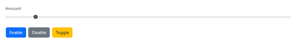
Disabled
Use the Disabled parameter to disable the RangeInput.
<div class="mb-3">
    <label class="form-label">Amount</label>
    <RangeInput TValue="int?"
                @bind-Value="amount"
                Disabled="@disabled"
                Min="0"
                Max="100" />
</div>

<Button Color="ButtonColor.Primary" @onclick="Enable"> Enable </Button>
<Button Color="ButtonColor.Secondary" @onclick="Disable"> Disable </Button>
<Button Color="ButtonColor.Warning" @onclick="Toggle"> Toggle </Button>
@code {
    private int? amount = 10;
    private bool disabled = true;

    private void Enable() => disabled = false;
    private void Disable() => disabled = true;
    private void Toggle() => disabled = !disabled;
}
Also, use Enable() and Disable() methods to enable and disable the RangeInput.
Do not use both the Disabled parameter and Enable() & Disable() methods.

<div class="mb-3">
    <label class="form-label">Amount</label>
    <RangeInput @ref="rangeInput"
                TValue="int?"
                @bind-Value="amount"
                Min="0"
                Max="100" />
</div>

<Button Color="ButtonColor.Secondary" @onclick="Disable"> Disable </Button>
<Button Color="ButtonColor.Primary" @onclick="Enable"> Enable </Button>
@code {
    private RangeInput<int?> rangeInput = default!;
    private int? amount = 10;
    private void Disable() => rangeInput.Disable();
    private void Enable() => rangeInput.Enable();
}
Min and max
Set the Min and Max parameters to restrict the user input between the Min and Max range. By default, the minimum is 0.
By default the maximum is 100 for sbyte?, short?, int?, long?, float?, double? and decimal? data types. For other data types it is 0.
If the user tries to specify a numeric value which is out of range, then it will override with Min or Max value based on the context. If the user input is less than the minimum value, then it will override with the Min value. If the user input exceeds the maximum value, it will override with the Max value.

<div class="d-flex flex-row mb-3">
    <RangeInput TValue="int" @bind-Value="amount1" Min="-10" Max="10" />
    <Badge Color="BadgeColor.Primary" Class="ms-2" VisuallyHiddenText="amount1">@amount1</Badge>
</div>
@code {
    int amount1 = -3;
}
Step
The Step parameter is a number that specifies the granularity that the value must adhere to. Only values that match the specified stepping interval are valid.

<div class="d-flex flex-row mb-3">
    <RangeInput TValue="int" @bind-Value="amount1" Min="0" Max="100" />
    <Badge Color="BadgeColor.Primary" Class="ms-2" VisuallyHiddenText="amount1">@amount1</Badge>
</div>
<div class="d-flex flex-row mb-3">
    <RangeInput TValue="int?" @bind-Value="amount2" Min="0" Max="100" Step="5" />
    <Badge Color="BadgeColor.Primary" Class="ms-2" VisuallyHiddenText="amount2">@amount2</Badge>
</div>
<div class="d-flex flex-row mb-3">
    <RangeInput TValue="float" @bind-Value="amount3" Min="0" Max="100" Step="10" />
    <Badge Color="BadgeColor.Primary" Class="ms-2" VisuallyHiddenText="amount3">@amount3</Badge>
</div>
<div class="d-flex flex-row mb-3">
    <RangeInput TValue="float?" @bind-Value="amount4" Min="0" Max="100" Step="20" />
    <Badge Color="BadgeColor.Primary" Class="ms-2" VisuallyHiddenText="amount4">@amount4</Badge>
</div>
@code {
    int amount1 = 10;
    int? amount2 = 20;
    float amount3 = 30;
    float? amount4 = 40;
}
Decimal values

<RangeInput TValue="decimal" @bind-Value="amount1" Min="0" Max="100" Step="0.01" />
<div class="mt-2">@amount1</div>
@code {
    decimal amount1 = 0;
}
Tick marks
To add tick marks to a RangeInput, set the TickMarks parameter.

<div class="d-flex mb-3">
    <div class="flex-fill">
        <RangeInput TValue="float" @bind-Value="temperature1" Min="0" Max="100" TickMarks="list" />
    </div>
</div>
<Badge Color="BadgeColor.Primary" Class="mx-2" VisuallyHiddenText="amount1">@temperature1</Badge>
<span>Fahrenheit</span>
@code {
    float temperature1 = 10;

    IEnumerable<TickMark> list = new List<TickMark>
    {
        new(){ Label = "very cold!", Value = "0"},
        new(){ Label = "cool", Value = "25"},
        new(){ Label = "medium", Value = "50"},
        new(){ Label = "getting warm!", Value = "75"},
        new(){ Label = "hot!", Value = "100"},
    };
}