Blazor Switch
Use the Blazor Bootstrap Switch component to show the consistent cross-browser and cross-device custom checkboxes.
Parameters
| Name | Type | Default | Required | Description | Added Version |
|---|---|---|---|---|---|
| Disabled | bool | false | Gets or sets the disabled state. | 1.3.0 | |
| Label | string | null | Gets or sets the label. | 1.3.0 | |
| Reverse | bool | false | Determines whether to put the switch on the opposite side. | 1.3.0 | |
| Value | bool | false | Gets or sets the value. | 1.3.0 |
Methods
| Name | Return Type | Description | Added Version |
|---|---|---|---|
| Disable() | void | Disables switch. | 1.3.0 |
| Enable() | void | Enables switch. | 1.3.0 |
Events
| Name | Description | Added Version |
|---|---|---|
| ValueChanged | This event fired when the switch selection changed. | 1.3.0 |
Examples
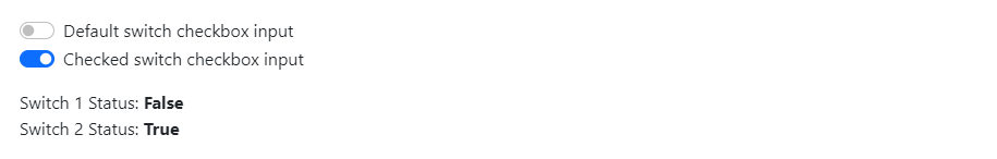
Basic usage
<Switch @bind-Value="agree1" Label="Default switch checkbox input" />
<Switch @bind-Value="agree2" Label="Checked switch checkbox input" />

<div class="mt-3">Switch 1 Status: <b>@agree1</b></div>
<div>Switch 2 Status: <b>@agree2</b></div>
@code {
    bool agree1;
    bool agree2 = true;
}
Disable
Disable
Use the Disabled parameter to disable the Switch.
<div class="mb-3">
    <Switch @bind-Value="agree" Disabled="@disabled" Label="Disabled switch checkbox input" />
</div>

<Button Color="ButtonColor.Primary" @onclick="Enable"> Enable </Button>
<Button Color="ButtonColor.Secondary" @onclick="Disable"> Disable </Button>
<Button Color="ButtonColor.Warning" @onclick="Toggle"> Toggle </Button>
@code {
    private bool agree = true;
    private bool disabled = true;

    private void Enable() => disabled = false;

    private void Disable() => disabled = true;

    private void Toggle() => disabled = !disabled;
}
Also, use Enable() and Disable() methods to enable and disable the Switch.
NOTE
Do not use both the Disabled parameter and Enable() & Disable() methods.
<div class="mb-3">
    <Switch @ref="switch1" @bind-Value="agree" Label="Disabled switch checkbox input" />
</div>

<Button Color="ButtonColor.Secondary" @onclick="Disable"> Disable </Button>
<Button Color="ButtonColor.Primary" @onclick="Enable"> Enable </Button>
@code {
    private Switch switch1 = default!;
    private bool agree = true;

    private void Disable() => switch1.Disable();

    private void Enable() => switch1.Enable();
}
Reverse
Put your switches on the opposite side by using the Reverse parameter.

<Switch @bind-Value="agree" Label="Reverse switch checkbox input" Reverse="true" />
@code {
    bool agree;
}
Events: ValueChanged
This event fired when the Switch selection changed.
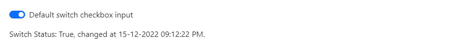
<Switch Value="agree" Label="Default switch checkbox input" ValueExpression="() => agree" ValueChanged="SwitchChanged" />
<div class="mt-3">@displaySwitchStatus</div>
@code {
    private bool agree;
    private string displaySwitchStatus;

    private void SwitchChanged(bool value)
    {
        agree = value; // this is mandatory
        displaySwitchStatus = $"Switch Status: {value}, changed at {DateTime.Now.ToLocalTime()}.";
    }
}